Introduction
In the world of data viz, creating a clear and informative matrix can often be a daunting challenge. Recently, I was tasked with developing a complex matrix in Power BI to display various brands alongside their key performance indicators (KPIs). This report required six measures for each brand and several time intelligence calculations – such as yesterday’s figures and week-to-date comparisons. Therefore, ensuring a cohesive and consistent visual style became a challenge. Adding to the complexity, I had to ensure that the conditional formatting aligned with that of previous reports for the same client.
In this post, we’ll explore how to build a matrix visual that pivots values to rows, groups them by dimensional hierarchies, whilst performing conditional formatting on our columns, which in this example, are calculated time intelligence measures.
The Challenge
As I began to set up the matrix, I quickly ran into a significant obstacle: Power BI’s default settings only allowed conditional formatting on the values section of the matrix. This limitation became frustrating when I pivoted the data to display KPIs as rows, causing the conditional formatting to be incorrectly applied along the horizontal axis instead of the intended vertical columns. My efforts to create a visually appealing and informative matrix were hampered by these constraints, and I needed to find a way to implement the conditional formatting rules effectively while preserving the integrity of the data presentation.
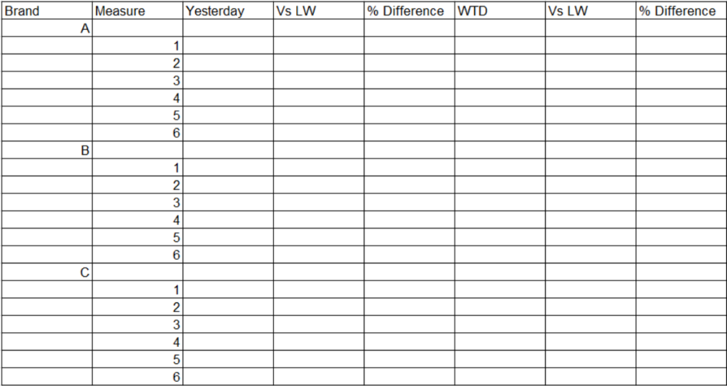
Exploration of Alternatives
In my quest for a solution, I initially considered hard coding the conditional formatting directly into the time intelligence columns. Using DAX formula, I was able to display up or down arrows based on the calculated values. While this approach worked for the “TW Vs LW” columns, it proved inadequate for the “% change” columns, limiting the overall functionality of my matrix.
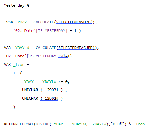
Additionally, formatting the values in the DAX query led to performance issues, significantly slowing down the report. I quickly realised that this method did not align with the existing aesthetics of my report pack, further complicating my efforts.
To enhance readability, I explored splitting the matrix into six separate matrices. One for each KPI, with countries as rows and individual measures for each time-period. This solution worked remarkably well for mobile viewing, allowing users to easily access all KPIs, brands, and time periods in a more digestible format when using devices in portrait mode. However, this approach was less ideal for desktop users, as navigating between six matrices became cumbersome and disrupted the seamless experience I intended to deliver.
Breakthrough Solution
After identifying the challenges in presenting a cohesive matrix with effective conditional formatting, I adopted a systematic approach to streamline the data structure and enhance the visual representation of KPIs across different brands.
1. Creating the Source Table: I initiated the solution by developing a new source table in Excel. This table organised essential measures associated with various brands, accompanied by an ordinal column to facilitate the correct sequencing of KPIs. This structured layout not only simplified data management but also allowed for straightforward integration with existing data models. For example:
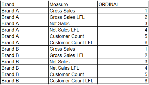
2. Establishing Relationships: To ensure seamless data interaction, I joined this new source table to the store dimension table using a cross-directional, many-to-many relationship based on the brand name. Although many-to-many relationships are generally avoided in Power BI due to potential complexity, they work in this case because the source table’s pre-aggregated KPIs and distinct brand names ensure efficiency and clarity in the model. This configuration maximised flexibility in how data could be accessed and analysed across the two tables.
3. Implementing Calculated Columns: Utilising a SWITCH() statement, I created calculated columns that enabled dynamic switching between the measures in the source table and the corresponding measures in the data model. A SWITCH() statement in DAX evaluates an expression against multiple conditions and returns the corresponding result for the first match. This approach allowed for targeted calculations based on specific KPIs while maintaining clarity in data representation.
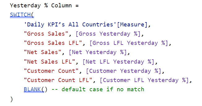
4. Developing Measures: Building on the calculated columns, I developed measures to sum the values required. This was essential for ensuring accurate aggregations, providing a comprehensive view of performance metrics across all brands and time periods. For example:

5. Applying Conditional Formatting: With the measures established, I leveraged Power BI’s built-in conditional formatting rules to enhance visual clarity. This consistency in formatting not only aligned with the existing report pack but also facilitated stakeholders in quickly identifying trends and insights.
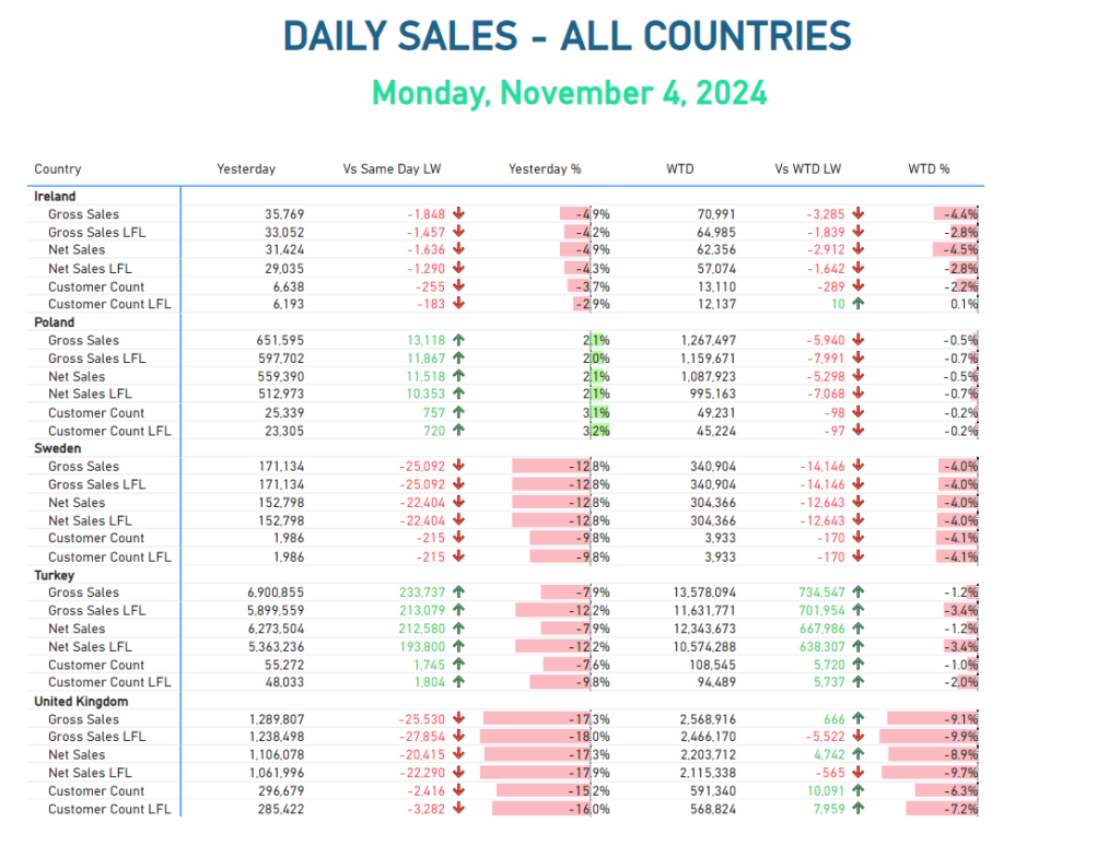
This solution not only resolved the immediate technical challenges but also enhanced the overall user experience for those engaging with the reports. The dynamic calculations enabled by the calculated columns ensure that the reports remain relevant and insightful, catering to the business’s evolving needs. Additionally, the focus on consistent formatting facilitates the identification of critical patterns, a fundamental concept in Data-Viz best practices.
Conclusion
By combining thoughtful data modelling and conditional formatting, we can transform raw data into actionable insights, empowering informed decision-making among various stakeholders. As we continue to navigate the complexities of data analysis, this approach serves as a valuable blueprint for future projects, ensuring our reporting remains insightful and adaptable to shifting business landscapes.
I encourage you to apply this method in your own reports and experience the improvements in your workflow!


