When I first joined Snap Analytics as an intern, I was introduced to the world of data visualisation. My primary focus was automating reports, and I thoroughly enjoyed every moment of it. I genuinely believed that was where my career would lead. Designing dashboards, telling stories through data, and seeing the direct impact of my work felt like the perfect fit.
After graduating, I returned to Snap and hit the ground running. My first project involved revamping outdated client reports. It was exciting to apply my knowledge on a larger scale, collaborating with clients and learning from senior visualisation experts around me. However, as the project progressed, my role shifted. I moved away from dashboards and dived headfirst into backend data engineering.
At first, it was a daunting transition. Training scenarios are one thing, but real-world projects are a completely different challenge. I worried about whether I’d pick things up quickly enough. But with support from my team and plenty of questions along the way, I grew to enjoy the challenges of data engineering more than I ever anticipated. There’s something deeply satisfying about building robust pipelines and data models – the backbone of everything visualisations rely on.
That said, I missed the creative outlet of visualisation. When you’re immersed in tables and backend logic, it’s easy to lose sight of how your work contributes to the final product. That’s why I loved it when Snap’s Data Visualisation team introduced the “Makeover Quarterly.” It’s a fun internal challenge where data engineers like me get to flex our front-end skills by creating dashboards based on quirky datasets. So far, we’ve tackled everything from curating the ultimate playlist to ranking top travel destinations.
These challenges are more than just fun – they bridge the gap between backend and frontend teams. By stepping into the shoes of a visualisation expert, I’ve gained a clearer understanding of what’s required to create cleaner, more effective solutions. It’s made me a better engineer because I can now see the bigger picture.
Recently, I even had the opportunity to use my visualisation background on the same client project where I’ve been focusing on backend work. I helped develop a Power BI best practices template to clean up their data models and make them easier to use. It felt like everything I’d learned – both frontend and backend – had come together to create something impactful.
Looking back, I can see just how valuable it has been to explore both sides of the data world. My journey has taught me that stepping out of your comfort zone, even when it feels intimidating, can lead to incredible growth. Thanks to the supportive environment at Snap, where learning and collaboration are always encouraged, I’ve had the opportunity to become a more well-rounded data professional.
Winning Entries

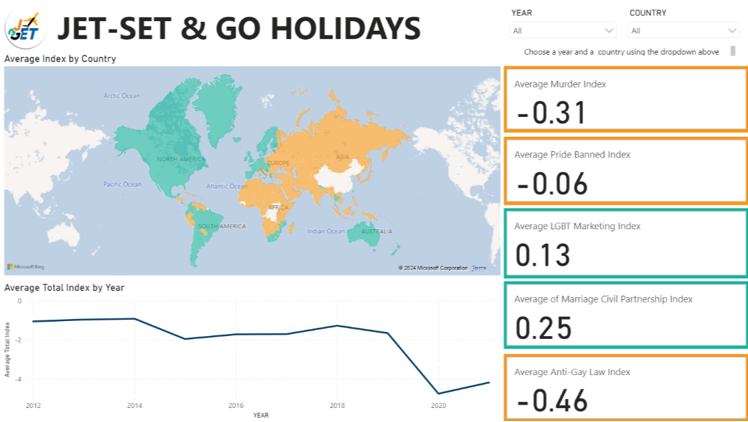
It’s clear how well visuals and data can work together to tell a story – the challenge was to explore LGBTQ+ inclusivity on a global scale. The map and color-coded indexes make it easy to see key insights, while the filters and trend chart add depth and interactivity. It’s a reminder that thoughtful design can make complex data feel accessible and engaging.

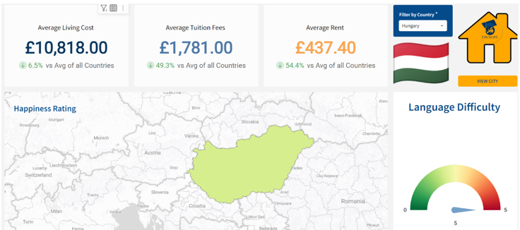
The aim was to produce a guide to students that highlights some of the most important factors when deciding where to move abroad. This dashboard is straightforward and visually appealing, with key numbers front and centre for quick takeaways. The map gives context to the country, while the flag and icons add a personal touch. The use of comparisons to global averages makes it easy to spot where Hungary stands out, and the language difficulty gauge is a nice, unexpected addition. It’s a well-balanced mix of practical info and engaging visuals.


