In Power BI, formatting colours for clustered bar charts can often feel like a repetitive, manual task – especially when using live date values as the legend. While applying a report theme can ensure consistency in colour schemes across the report, it also restricts flexibility, particularly when you want to introduce variation across different pages. In my case, I was dealing with weekly sales data where the financial week start date frequently changed, and updating the colours manually each week became too time-consuming. In this post, we explore how to automate dynamic colour formatting, enabling us to keep a cohesive look while effortlessly adapting to changing financial week data without manual updates.
Problem
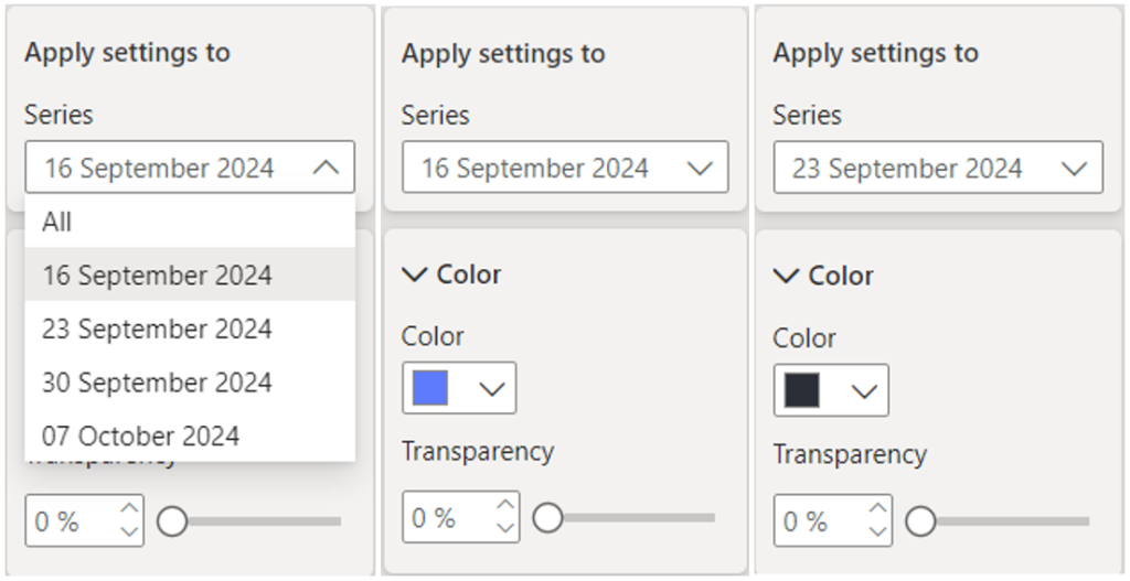
When using live and continuous date columns as the legend in a clustered bar chart, we can format individual elements, such as adjusting the colour of the bars or adding borders. However, any manually applied conditional formatting on the legend will revert to the default theme after each dataset refresh. This occurs because even minor changes in the data or shifts in the order of values cause Power BI to treat them as entirely new, thus forgetting the previous formatting.
Solution
One solution for this issue is to use a cyclical date column, such as the calendar month number. However, with this approach, we would still need to re-format the visual each month for an entire year until we return to the starting values. While this method works, repeating the process monthly becomes tedious and time-consuming.
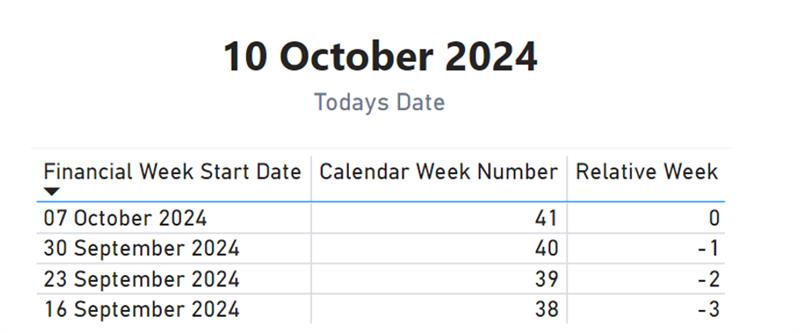
Instead, a preferable solution is one that only needs to be implemented once and remains valid. To achieve this, we can use a “relative week” column in the date dimension, which calculates how far ahead or behind each date is from the current date. This ensures that legend values remain consistent, even after data refreshes.
Methodology
The “relative week” column is a calculated field that evaluates each date in the table and returns how many weeks ago or ahead that date is from today. The result is stored as a whole number, with positive numbers representing future weeks and negative numbers indicating past weeks. This simple but effective approach enables us to track relative time periods consistently across reports.
Here is the SQL logic we use to translate the numerical relative week values into more meaningful text:
CASE
WHEN RELATIVE_WEEK > 1 THEN (‘In ‘ || RELATIVE_WEEK::VARCHAR || ‘ Weeks’)
WHEN RELATIVE_WEEK = 1 THEN ‘Next Week’
WHEN RELATIVE_WEEK = 0 THEN ‘This Week’
WHEN RELATIVE_WEEK = -1 THEN ‘Last Week’
ELSE (-RELATIVE_WEEK::VARCHAR || ‘ Weeks Ago’)
END
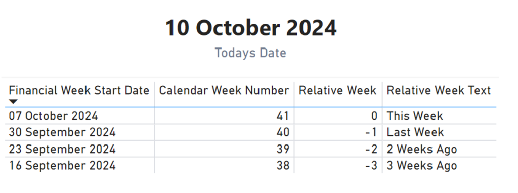
This SQL logic converts the relative week values into intuitive text, such as “Last Week” or “3 Weeks Ago”. By using text-based legend entries, Power BI treats the values as consistent across dataset refreshes, preventing the formatting from resetting.
Conclusion
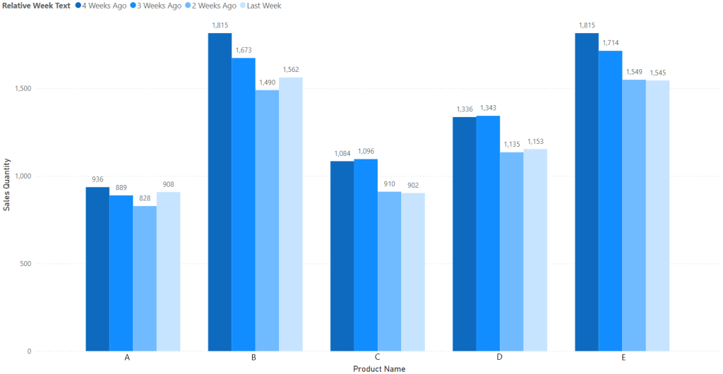
By converting relative week values into text, we can ensure that our legend remains consistent after each refresh, preserving our conditional formatting without manual intervention. This simple automation technique streamlines the reporting process and guarantees a stable, dynamic visual experience in Power BI.
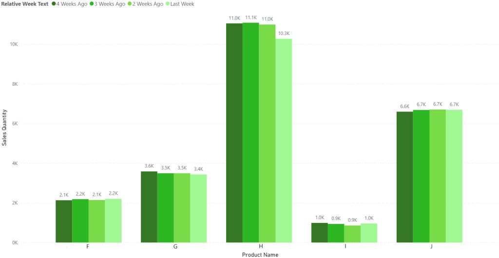
I encourage you to try this method in your own reports and see how it improves your workflow!


