Colour has the power to tell a story at a glance, but it’s also one of the easiest ways to mislead or confuse in data visualisation. When used thoughtfully, colour reveals patterns, clarifies relationships, and helps readers make sense of the data. However, poor colour choices can obscure key insights or distort the message entirely.
Understanding how to use colour wisely is a skill every data storyteller needs. In this post, we’ll explore the fundamentals of using colour effectively in data visualisation. From selecting the right palette to ensuring accessibility and consistency, these best practices will help you make your visuals not only look better but work better.
The Psychology of Colour
Colour is deeply ingrained in human psychology, influencing how we perceive and respond to information. For instance:
- Red often conveys urgency or danger, linked to its associations with blood and fire.
- Green is widely seen as calming, evoking safety and abundance, a remnant of a time when lush greenery signalled a reliable source of food and shelter.
However, the meaning of colours isn’t universal. Cultural and contextual differences play a significant role in how colours are interpreted:
- In Western cultures, blue is viewed as professional or calming, while in parts of Central and South America, it may symbolise mourning.
- Red, which can signify good fortune in China, might represent financial losses in a Western business report.
Being mindful of your audience and their cultural context ensures your colour choices resonate appropriately.

The Basics of Colour Selection
When choosing colours for data visualisation, the goal is clarity and speed. The “10-second rule” suggests viewers should grasp the key message of your visual in under 10 seconds. Your colour choices should guide their focus instinctively.
- Contrast
High contrast ensures your data is easy to read and interpret. For example:
- Use dark text on a light background or vice versa for optimal legibility.
- For line charts or bar graphs, contrasting colours can help distinguish data points and highlight trends.
Striking the right balance between clarity and simplicity is essential. Too much contrast can overwhelm, while too little can obscure key details.
- Highlighting with Colour
A good rule of thumb is to use a single “highlight” colour for the most important data point, keeping secondary information in neutral or muted tones. For example:
- In a sales report, you might use green to represent revenue, while supporting metrics like budget or costs could be displayed in shades of grey or blue.
This helps your audience immediately focus on what matters most without feeling overwhelmed.
- Less is More
Treat colour like toppings on a pizza, less is often more. Stick to three main colours to avoid confusing or overwhelming your audience. A minimal colour scheme not only looks clean but keeps the focus on the data itself.
Gradients or shades of a single colour can also help communicate variation without introducing unnecessary complexity. For example, visualising sales data across multiple products and time periods can remain clear when a single colour family is used with varying intensities.

Consistency is Key
“Small disciplines repeated with consistency every day lead to great achievements.” – John C. Maxwell
Consistency in colour isn’t just about aesthetics, it’s about guiding the viewer’s eye and reducing cognitive load. Here’s how to achieve it:
- Use brand colours wisely: For example, if your brand colour is blue, you can use it for positive metrics, titles, or key information to create cohesion across visuals.
- Set clear rules: Assign specific colours to metrics (e.g. green for growth) and stick to these rules across your report.
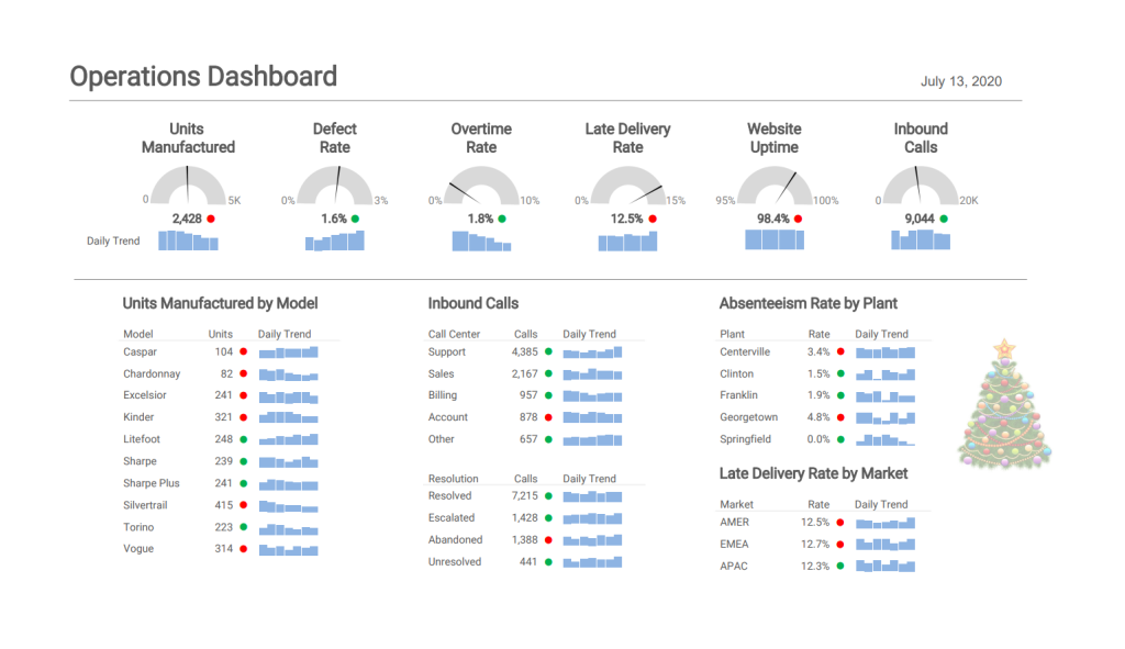
- Avoid the ‘Christmas Tree’ effect: Overloading visuals with too many colours, or many uses of the same colour, can distract and overwhelm. Instead, use accent colours sparingly for maximum impact.

A is for Accessibility
Colour should enhance your visuals, not overwhelm them. Importantly, it must also be inclusive and accessible to all audiences.
- Design for Colourblind Users
Around 8% of men and 0.5% of women have some form of colour vision deficiency. To ensure accessibility:
- Use tools like ColorBrewer or colourblind-safe palettes in software like Power BI.
- Opt for combinations that are easy to distinguish, such as blue and orange, instead of red and green.
Additionally, consider offering a “colour-blind mode” in interactive reports. This not only improves inclusivity but also highlights your technical skills if you’re coding visualisations.
- Layer with Patterns and Labels
Colour alone shouldn’t carry the meaning. Adding patterns, textures, or clear data labels ensures your visual is accessible to everyone, regardless of their ability to perceive colours.
- Run Accessibility Checks
Test your visuals by temporarily desaturating them to black and white. If the data remains clear and interpretable, you’ve achieved accessibility.
Wrapping It All Up: Colour in Data Visualisation
Colour is a powerful tool, but its impact lies in thoughtful application. To summarise:
- “One bright colour = one big impact”: Use vibrant colours sparingly to highlight key points.
- “Use contrast wisely”: Ensure sufficient contrast for legibility without overloading the visual.
- “Let data drive your palette”: Choose colours that support the story your data is telling.
- Take action: Limit your colour palette, maintain consistency, and check for accessibility.
Finally, don’t be afraid to experiment. Test your colour schemes with your audience, gather feedback, and refine your approach over time. By following these principles, you’ll create visuals that are not only eye-catching but also effective and inclusive.
Useful Links & Sources:
Creating accessible reports in Power BI – Power BI | Microsoft Learn
ColorBrewer: Color Advice for Maps
Featured blog posts — Practical Reporting Inc.


