A 2019 psychology study into online dating behaviours showed it takes on average 3-6 seconds for app users to decide whether they will swipe left (“no”) or right (“yes”) on another profile. Both genders took less time, about 3-5 seconds, to match with profiles they found attractive, and longer (5-6 seconds) viewing profiles they disliked and ultimately swiped left on. Perhaps counterintuitively, what this suggests is that the more successful a profile is, the less time users spend viewing it.
So, what does any of this have to do with data visualisations?
Aside from providing an interesting insight into the behaviours of dating app users, these findings are consistent with what our brain does when processing all kinds of images – classical art, data visualisations, and Tinder profiles alike. The brain loves images; it can process visuals extremely quickly (60,000 faster than text), can recognise familiar and unfamiliar images in as little as 13 milliseconds, and spends all day long processing visual information, rapidly creating associations and concepts, and storing them. Our brains are fast and must do a lot for us, so it is no surprise that it has limited time to take in key information before drawing conclusions and moving on to something more pressing. This is what is known as the 5-second rule in Data Visualisation (or data viz) – the short window of time we have to engage users, capture their attention, and quickly communicate the key pieces of information to help drive decision-making with minimal friction. Much like dating profiles, an unsuccessful visualisation or dashboard will have users spend lots of time attempting to navigate and extract the information they need, leaving them searching for something better instead, and making that fatal swipe left. This has become even more pertinent in recent years, where the amount of information we are bombarded with every day is increasing and our attention spans are decreasing. People are simultaneously busy and bored. This window of 5 seconds can be leveraged for a powerful impact on users but can also be the reason countless visualisations fail to meet a primary objective, to communicate important information quickly.
This blog will outline three actionable principles to follow to ensure your dashboards pass the 5-second rule, by taking some nuggets of wisdom from the world of online dating apps.
Three principles to adhere to
1. Tell a story
Storytelling plays a central role in data viz as it is the narrative thread that weaves raw data together into a coherent and meaningful whole. Before developers embark on building a dashboard it is important to ask the fundamental question: Who is my audience? And to continue asking this question at each stage of development. Every element of a dashboard should resonate with its intended viewers and a clear sense of narrative should be maintained throughout. If there is an element which does not fit cohesively or contribute to the overall narrative, it will feel out of place, and lead to increasing friction during user experience.
Presenting data without a story lacks impact as it does not guide the audience toward desired action or help drive decisions. Storytelling with such a focus will create strong engagement with the audience and will give them a better understanding of the data. This ultimately leads to increased retention and recall of the insights gained in the dashboard long after the audience have used it. The goal of a dating profile and a strong visualisation are much the same in this respect – they aim to form a lasting impression in the audience’s mind.

2. Visuals are superior to text, but prettier isn’t always better
Have you ever seen a dating profile with only one, blurry picture, a wall of text, and not even an emoji in sight? It’s safe to say, the profile probably isn’t getting very much engagement. Similarly, a dashboard doesn’t need to be beautiful, but the visuals should be the star of the show. Pre-attentive processing, the subconscious experience of processing information from the environment, plays a significant role in this. The brain can process images, find patterns, and draw conclusions far quicker in images than text, and before we are even consciously aware we have processed it. Visuals are superior to text in creating association and memory as they stimulate and engage both hemispheres of the brain.
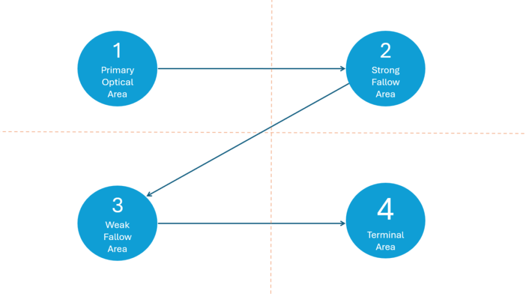
Dashboards should be pleasing to the eye; however, it is important not to over-clutter with excessive visual elements. A clean and cohesive design, which is easy to navigate, is king. The audience’s attention should be drawn immediately to the most important aspects of the dashboard without friction and creating a clean, simple dashboard will enable this. Eye-tracking studies have shown that the area of a website which receive the most attention is the top-left corner, so it is beneficial to place important visuals in that zone. The Gutenberg diagram shows how the pattern which the eye follows when scanning visual content.
Accessibility is also crucial to creating a successful dashboard and passing the 5-second rule. Some things to consider include using colours which are accessible for users with visual impairment, using a clear font (i.e. Arial, Helvetica, Verdana), and appropriate font size (size 9-14 is usually a good range to be in).
3. Be original and avoid cliches
According to this Forbes article, many dating profiles fall short because they are laden with cliches and are highly predictable. Much like this, dashboard users will grow bored of viewing the same type of dashboard and visuals over and over. Original and interesting design elements will capture the interest of the audience and could be the final piece in helping your dashboard pass the 5-second rule. Some simple yet effective examples of how to do this could be through increased interactivity on the dashboard, interesting uses of colour, animation, and making dashboards available on devices such as mobile. It is however important not to go too overboard with creativity as it may lead to clutter and confusion of the overall narrative. Additionally, creativity should come second to choosing visuals and design features which are appropriate for the data story at hand.
To tie all three principles together, it can be impactful to take an original element of your dashboard design, such as a distinctive use of colour, and make it into a trademark which is uniform across all dashboards. Features such as this will become recognisable to viewers as part of an overall brand identity.
Consistent with the findings on dating app behaviours, the less time a user needs to spend viewing a dashboard the better. Hopefully, the above principles will aid you in designing dashboards which pass the 5-second rule.
Reference links
https://www.t-sciences.com/news/humans-process-visual-data-better
https://www.frontiersin.org/articles/10.3389/fpsyg.2019.02010/full
https://www.mic.com/life/we-speed-swipe-on-tinder-for-different-reasons-depending-on-our-gender-18808262
https://www.forbes.com/sites/traversmark/2022/10/24/new-psychological-research-identifies-2-ingredients-of-a-great-dating-profile/?sh=7abf8dd412e0
https://uxmovement.com/buttons/why-users-click-right-call-to-actions-more-than-left-ones/
https://www.datastudio.ca/design-and-formatting/storytelling-for-data-and-design/
https://www.presentation-company.com/blog/data-visualization-vs-data-storytelling-whats-the-difference
https://www.viewabo.com/blog/visual-vs-textual-information-which-gets-the-attention
https://www.linkedin.com/pulse/pre-attentive-processing-data-visualization-salma-hafez