snap-analytics-logo

Snap Analytics Three Peak Challenge 2024

It is 5 AM and every step up the mountain hurts. The pace is relentless as we’re behind schedule. Breaks are limited to five minutes every half hour, and that is for the leading pack. Those who can’t keep up with the pace catch up, take their drink standing and have to continue immediately. Nervousness creeps in: This is only the ascend of the second mountain of our Three Peak challenge. The descent, although faster, will hurt more. After that, there is still one more mountain to complete. Can we really do this, or have we bitten off more than we can chew?

On a Thursday afternoon, a team from Snap Analytics set off for their Three Peaks Challenge: Completing the highest mountain in Scotland, England and Wales within 24 hours. Why? The easy answer is that we are raising funds for an IT suite at Hayesfield School for girls. See boxed text for more information. We are very grateful to the many people who made a contribution. Thank you!
Fundraising is only part of the motivation though. Our team of 13 have also signed up for this out of a sense of adventure, for personal achievement, a test of physical and mental toughness and last but not least to spend time together as a team outside the normal working environment.

Stage 1: Ben Nevis (Altitude 1345m, 17km up and down)

The team sets off in great spirit and at great pace. Perhaps too good a pace, as at the first break it is clear not everyone can keep up. The group splits and there are some concerns whether everyone will be able to complete it. This becomes more of a concern at the summit, where the first group decides to start the descend before the last group arrives. On our way back the difficult decision is made to ask the people who are furthest behind to turn around before reaching the top, so we can set off for Scarfell Pike in good time.

Snap Analytics is raising money for a new IT Suite at Hayesfield school
Snap Analytics believe that everyone should have the right to a STEM education. We want to encourage more women to pursue a career in STEM, and we believe that this begins from the opportunities that you are given in school. This is why we’re working with Hayesfield Girls School, a local state school in Bath, to raise money for their new IT Suite. You can donate here:
justgiving.com snap-analytics-3-peaks-challenge

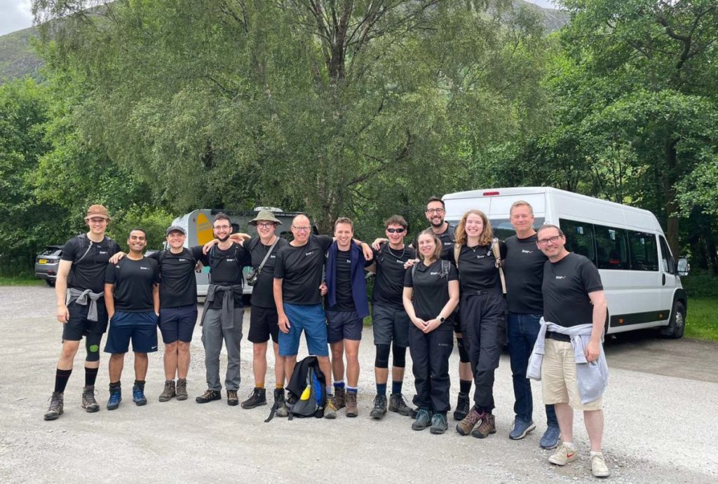
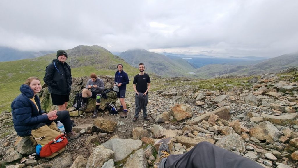
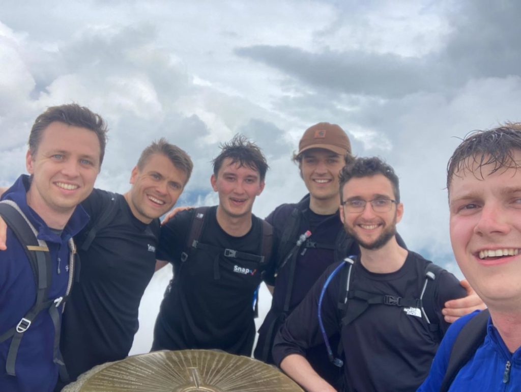
The Snap team at the start of Ben Nevis. From left to right: Tom (TC), Raj, Tom B, Dan, Mark, Jan, Ben K, Ben W, Nancy, Paul, Anna and drivers Jamie and Dave

Waiting at the foot of Ben Nevis for everyone to return we experience our first set-back: Paul has rolled his ankle, twice, and is struggling to get off the mountain. There is not much we can do other than wait. Finally, 1h15 minutes after the first group, Paul makes it back. Our drivers, Jamie and Dave, have managed to get some ice packs and medication. After a quick treatment, we’re on our way to the Lake District.

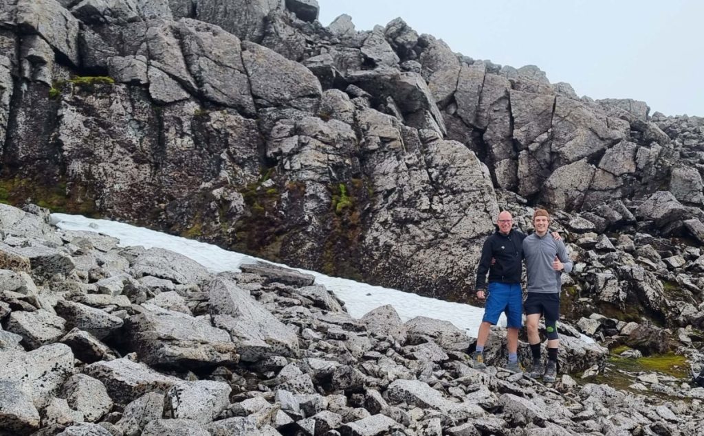
The last remainders of snow on Ben Nevis

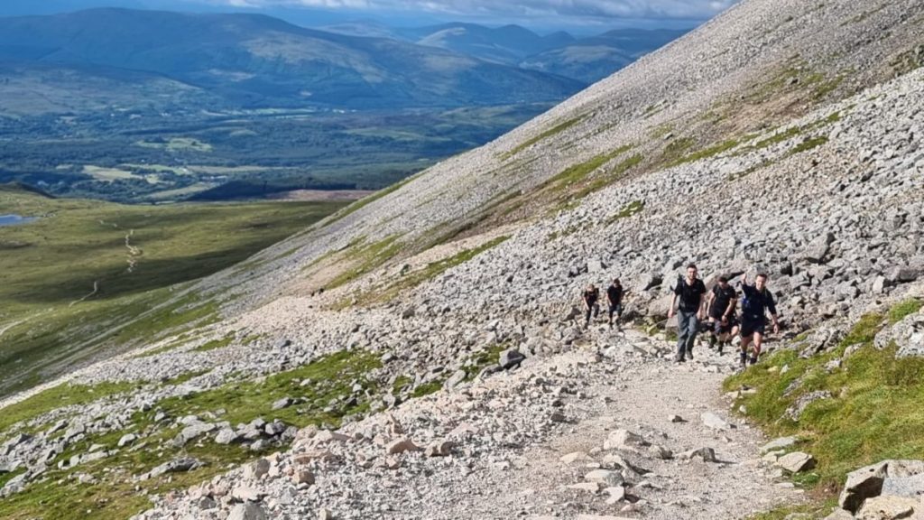
Stage 2: Scafell Pike (Altitude 978m, 10km up and down)

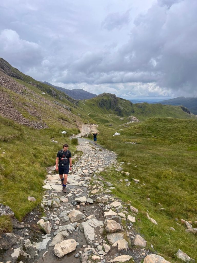
Roadworks have caused further delays and we’re setting off at 5AM, one hour behind schedule. Although Scafell Pike is the lowest mountain and shortest walk, it’s a tough mountain to climb. The three youngsters (TC, Mark and Ben K) speed ahead and are already on their way down when I reach the top. The last 15 minutes up are really tough going with loose rocks to scramble over and the top being further away every time we think we’re there. Soon after I start making the descent, I meet the last group on the way up. Paul has managed to keep a good pace, despite his injury and I feel more optimistic about gaining back some time on the schedule.
Ben K completed Scafell Pike in just under three hours, and most of the others follow shortly after. Raj gets a big cheer as he returns, having made it to the top and coming back within the 4hrs scheduled time. Unfortunately, Paul’s injury played up during the descent. We set off to Snowdon severely behind schedule but the big blow is that Paul has to pull out due to injury. Paul has put a lot of effort in organizing the trip and get everyone prepared and is obviously gutted he now can’t complete it.

From left to right: Ben Nevis, Scafell Pike, Snowdon

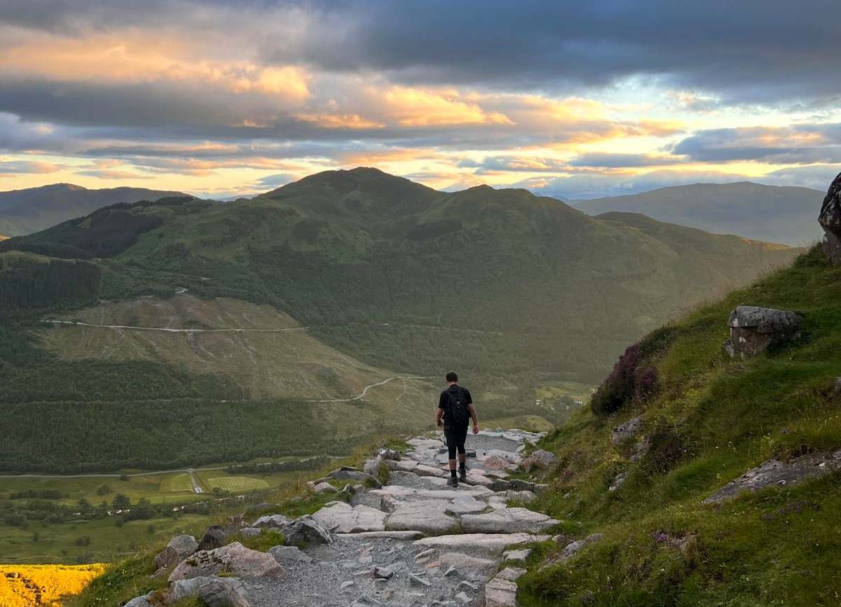
Stage 3: Snowdon (Altitude 1085m, 11km up and down)

We arrive at Snowdon just after 4PM, three hours behind schedule. The journey out of Scafell was a nightmare, with heavy traffic on single-track lanes. Not easy when you’re driving a 17-seater bus. I was blissfully unaware of the challenges as I was knocked out by a anti-travel sickness pill. Despite being in an uncomfortable seat and being cramped in by backpacks I slept for most of the way. En route we said goodbye to Paul (injured) and Nancy (who had always planned to join us for two of the three peaks).

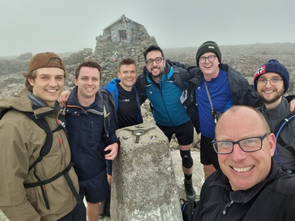
Raj, Anna and I knew we couldn’t get to the top on time to get back in time for our last train back to London but we gave it our best shot to get as far as we could. Anna almost ran up the mountain, with Ben K on her side and me shortly after. We took the Pyg track, which means to the top is only a 723m ascent, but it was steeper than expected. We managed to complete 2.5km, just short of the halfway point. Ben K and Dan decide to wait for the last four to regroup so they would make the journey to the top together. Anna, Raj and I head back to the bus to catch our train, with mixed feelings. Having come this far we would all have loved to get to the top, but we can take pride in how much we managed to do in the time we had available. Tom Bruce, TC, Ben K, Mark, Dan and Ben W reached the summit 18:17 and the round-trip took them 4 hours. An amazing achievement, and mission completed!

For those interested in the breakdown of the timings, there is a table at the bottom of this page with all the details.

Mission completed

The experience was physically challenging but great fun to do. Each of the three mountains is unique but they are all stunningly beautiful. It was nice to spend time with colleagues outside of normal work.

I am a fairly competitive person (although mellowed somewhat over the years) and when I join a challenge, I tend to think in terms of winning and failing. From that perspective, we failed: Only six from ten people completed the challenge, and they took 3:30hrs longer than the 24hr limit. What I learned is that the 24 hours is just a number and we’re not trying to qualify for the Olympics. A few hours more or less is really not that important. In hindsight, I could have been less obsessive about the timings and let everyone enjoy the experience a bit more. I also thought I would be devastated if I did not complete the challenge in time or, in my case, not at all. Yes, I am somewhat disappointed, but also proud of what I achieved and what we achieved as a team. Most of all though, we all had a great time.

From a fundraising perspective, the challenge was a success as well. At the moment of writing, nearly £2,000 has been donated, and I know there are some pledges outstanding. Again, many thanks to all the people who have made a contribution. Finally, a big thank you to Snap Analytics. Snap Analytics kindly covered the operational aspects of the challenge, providing transport, accommodation and an amazing t-shirt!

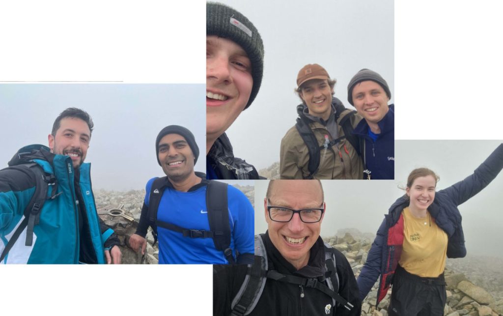
Views from the top: Ben Nevis, Scafell Pike and Snowdon

Facts and figures

Snap Analytics is a data company so here are some facts and figures. I am sure someone will come up with beautiful visualisations, but for now, the raw data is here:

PlanFast
group
Complete
group
DurationTimeDurationDuration
Start Ben Nevis17:0017:00
Complete Ben Nevis05:0022:0004:0605:19
Drive to Scafell Pike06:0004:0007:03
Complete Scafell Pike04:0008:0002:5604:42
Drive to Snowdon05:0013:0006:19
Complete Snowdon04:0017:0004:01

Why & How You Should Apply Principles of Effective Dating Profiles to Your Data Visualisations

A 2019 psychology study into online dating behaviours showed it takes on average 3-6 seconds for app users to decide whether they will swipe left (“no”) or right (“yes”) on another profile. Both genders took less time, about 3-5 seconds, to match with profiles they found attractive, and longer (5-6 seconds) viewing profiles they disliked and ultimately swiped left on. Perhaps counterintuitively, what this suggests is that the more successful a profile is, the less time users spend viewing it.

So, what does any of this have to do with data visualisations?

Aside from providing an interesting insight into the behaviours of dating app users, these findings are consistent with what our brain does when processing all kinds of images – classical art, data visualisations, and Tinder profiles alike. The brain loves images; it can process visuals extremely quickly (60,000 faster than text), can recognise familiar and unfamiliar images in as little as 13 milliseconds, and spends all day long processing visual information, rapidly creating associations and concepts, and storing them. Our brains are fast and must do a lot for us, so it is no surprise that it has limited time to take in key information before drawing conclusions and moving on to something more pressing. This is what is known as the 5-second rule in Data Visualisation (or data viz) – the short window of time we have to engage users, capture their attention, and quickly communicate the key pieces of information to help drive decision-making with minimal friction. Much like dating profiles, an unsuccessful visualisation or dashboard will have users spend lots of time attempting to navigate and extract the information they need, leaving them searching for something better instead, and making that fatal swipe left. This has become even more pertinent in recent years, where the amount of information we are bombarded with every day is increasing and our attention spans are decreasing. People are simultaneously busy and bored. This window of 5 seconds can be leveraged for a powerful impact on users but can also be the reason countless visualisations fail to meet a primary objective, to communicate important information quickly.

This blog will outline three actionable principles to follow to ensure your dashboards pass the 5-second rule, by taking some nuggets of wisdom from the world of online dating apps.

Three principles to adhere to
1. Tell a story

Storytelling plays a central role in data viz as it is the narrative thread that weaves raw data together into a coherent and meaningful whole. Before developers embark on building a dashboard it is important to ask the fundamental question: Who is my audience? And to continue asking this question at each stage of development. Every element of a dashboard should resonate with its intended viewers and a clear sense of narrative should be maintained throughout. If there is an element which does not fit cohesively or contribute to the overall narrative, it will feel out of place, and lead to increasing friction during user experience.

Presenting data without a story lacks impact as it does not guide the audience toward desired action or help drive decisions. Storytelling with such a focus will create strong engagement with the audience and will give them a better understanding of the data. This ultimately leads to increased retention and recall of the insights gained in the dashboard long after the audience have used it. The goal of a dating profile and a strong visualisation are much the same in this respect – they aim to form a lasting impression in the audience’s mind.

2. Visuals are superior to text, but prettier isn’t always better

Have you ever seen a dating profile with only one, blurry picture, a wall of text, and not even an emoji in sight? It’s safe to say, the profile probably isn’t getting very much engagement. Similarly, a dashboard doesn’t need to be beautiful, but the visuals should be the star of the show. Pre-attentive processing, the subconscious experience of processing information from the environment, plays a significant role in this. The brain can process images, find patterns, and draw conclusions far quicker in images than text, and before we are even consciously aware we have processed it. Visuals are superior to text in creating association and memory as they stimulate and engage both hemispheres of the brain.
Dashboards should be pleasing to the eye; however, it is important not to over-clutter with excessive visual elements. A clean and cohesive design, which is easy to navigate, is king. The audience’s attention should be drawn immediately to the most important aspects of the dashboard without friction and creating a clean, simple dashboard will enable this. Eye-tracking studies have shown that the area of a website which receive the most attention is the top-left corner, so it is beneficial to place important visuals in that zone. The Gutenberg diagram shows how the pattern which the eye follows when scanning visual content.

Accessibility is also crucial to creating a successful dashboard and passing the 5-second rule. Some things to consider include using colours which are accessible for users with visual impairment, using a clear font (i.e. Arial, Helvetica, Verdana), and appropriate font size (size 9-14 is usually a good range to be in).

3. Be original and avoid cliches

According to this Forbes article, many dating profiles fall short because they are laden with cliches and are highly predictable. Much like this, dashboard users will grow bored of viewing the same type of dashboard and visuals over and over. Original and interesting design elements will capture the interest of the audience and could be the final piece in helping your dashboard pass the 5-second rule. Some simple yet effective examples of how to do this could be through increased interactivity on the dashboard, interesting uses of colour, animation, and making dashboards available on devices such as mobile. It is however important not to go too overboard with creativity as it may lead to clutter and confusion of the overall narrative. Additionally, creativity should come second to choosing visuals and design features which are appropriate for the data story at hand.
To tie all three principles together, it can be impactful to take an original element of your dashboard design, such as a distinctive use of colour, and make it into a trademark which is uniform across all dashboards. Features such as this will become recognisable to viewers as part of an overall brand identity.

Consistent with the findings on dating app behaviours, the less time a user needs to spend viewing a dashboard the better. Hopefully, the above principles will aid you in designing dashboards which pass the 5-second rule.


Reference links

https://www.t-sciences.com/news/humans-process-visual-data-better
https://www.frontiersin.org/articles/10.3389/fpsyg.2019.02010/full
https://www.mic.com/life/we-speed-swipe-on-tinder-for-different-reasons-depending-on-our-gender-18808262
https://www.forbes.com/sites/traversmark/2022/10/24/new-psychological-research-identifies-2-ingredients-of-a-great-dating-profile/?sh=7abf8dd412e0
https://uxmovement.com/buttons/why-users-click-right-call-to-actions-more-than-left-ones/
https://www.datastudio.ca/design-and-formatting/storytelling-for-data-and-design/
https://www.presentation-company.com/blog/data-visualization-vs-data-storytelling-whats-the-difference
https://www.viewabo.com/blog/visual-vs-textual-information-which-gets-the-attention
https://www.linkedin.com/pulse/pre-attentive-processing-data-visualization-salma-hafez

SNP Glue – setting a new standard for getting data out of SAP

Time and time again SNP Glue has proven it can meet the most challenging requirements for getting data out of complex SAP environments and into Cloud Data Platforms. It can do that within impressive timeframes, keeping large transaction volumes in sync with very little latency. It is no wonder the Snowflake <> SNP partnership is so successful, especially since SNP launched the Snowflake Native App last year.
Now, SNP Glue is about to get better. At SNP’s annual event, Transformation World, a heap of innovations were announced, either recently released or on the roadmap to be released soon. We’ll take a look at that shortly, but first let’s get this out of the way:

Full disclosure
Snap Analytics is an independent System Integrator. When we advise customers about vendor products, we do that based on the best fit considering product capabilities and organizational requirements (technical landscape, available skillsets, ways of working, and anticipated future requirements) .
SNP Group kindly invited me to the SNP Transformation World event where I, and other invited partners, enjoyed SNP’s hospitality. Many thanks SNP Group for organizing a great event, with lots learning, networking and fun, and thanks for your generosity.
SNP Group is not paying for this article, nor have they asked for any publicity in return for hospitality.
About SNP Group and SNP Glue

SNP Group assists companies with their digital transformation prsocesses for SAP. Their software is widely used for SAP migrations and for SAP company carve-outs and mergers. SNP Glue is a product in SNPs product suite which is perhaps less widely known, but very relevant for Coud Data Warehouse solutions. SNP Glue is built on the foundations of DataVard, which was bought by SNP Group in 2021.

SNP Glue – product capabilities

SNP Glue is a data replication tool, designed for replicating data from SAP to anywhere. It has some integration capabilities (for example, datatype conversion) and is starting to reach beyond SAP as a source, with capabilities to replicate data from various cloud platforms to any target. SNP Glue is a robust application which can handle data volumes at scale. It is implemented on the SAP application platform, which means you don’t need an enterprise license for the database to run it. (More info on SAP runtime vs enterprise license can be found here).  

The SNP Glue product features overlap with replication products from other vendors, such as Theobald, Fivetran, Qlik Replicate and SAP SLT. There are important differences between the products, but each of these products can be used to move data up from SAP to a cloud data platform in ‘near real time’. I would love to see a product-by-product comparison for replication measures (how many changes / MB) can be captured and loaded into the cloud per second, how much load does the application put on the source system?). As far as I know there are no benchmark results publicly available. There is plenty of anecdotal evidence though. At Transformation World, Roger Pearson explained how Smith & Nephew uses SNP Glue to keep Snowflake in synch with a variety of SAP systems and very large tables (10x billions rows). Smith & Nephew had done a very extensive 3rd party tool comparison, and found that SNP Glue was the only product meeting their requirements. That doesn’t mean SNP Glue is the best fit for every customer – it is a testimony that SNP Glue works really well in a complex SAP landscape replicating large volumes of data.

User interface

SNP Glue is built on the SAP application platform which means the user interface looks like SAP and is aimed at technical users. I know many developers really like the SAP GUI, and so do I,  but it does scare off some of the potential users. If you are a data engineer and you have never used SAP (GUI) before, you would probably prefer a slick web interface over the SAP GUI. Well, the web interface is here! I was invited to do a test drive and to my delight the user experience is very satisfying. It is responsive, clean and intuitive. Any data engineer can use this, without any SAP knowledge whatsoever.

Below are some screenshots. For those familiar with the SAP content you might notice that the interface seamlessly merges CDS views and tables in the available sources list. Nice.

Right-click on any of the above pictures and “open in new tab” for a full-screen image.

The SAP GUI is still available. The web functionality is not yet on par with the features available in the SAP GUI. Some specialist features are only available in the SAP GUI.

SNP Product roadmap

The biggest announcement was made during the keynote speech: SNP will launch a new product,  SNP Kyano, which will support data replication from a wide variety of sources to a wide variety of targets. This means that enterprises could potentially use a single platform for all their data replication needs. There is clearly some overlap with SNP. Why SNP chooses to introduce a new product instead of building out SNP Glue (which was already moving into ‘anything to anything’ replication) is not clear to me. Hopefully in the next few months we see a clear roadmap for both products, to help understand which product is most suitable for what use case. Here is a link to the official communication about Kyano:

https://www.snpgroup.com/en/about-snp/news/transformation-world-2024-snp-expands-its-crystalbridge-solution-for-improved-integration-and-greater-business-agility

Data transformation features

For SNP Glue, there was mentioning of a ‘data transformation add-on’. Currently SNP Glue does not do data transformation, other than datatype conversion. With transformation capabilities, SNP Glue could become a one-stop-shop for data ingestion and data transformation for cloud data warehouses. The cherry on top would be if SNP Glue would also come with pre-delivered content models, as some competitors do for popular enterprise applications (Salesforce, ServiceNow). The institutional understanding of SAP in SNP Group is magnificent. I can’t think of any party better positioned to deliver pre-built SAP models, other than SAP themselves. This is only wishful thinking for now, it is not on the roadmap yet.

Further deep integration in Cloud Platforms

A final development to mention is the deep integration of SNP Glue with the hyperscalers and leading cloud data platforms: There is a native plug-in for Snowflake, close collaboration with Google Cloud Platform (Google Cortex) and (unconfirmed) rumour goes that deep integration with Azure OneLake/Fabric is in the making.

Alternatives to SNP Glue

The SNP Glue product features overlap with replication products from other vendors, such as Theobald, Fivetran, Qlik Replicate and SAP SLT. As well as similarities, there are important differences between these products as well. There is no best product for all solutions, and understanding your organisations’ requirements is key to being able to select the best fit for you. Examples of questions to ask are:

  • Is the only scenario to consider SAP > Cloud or are there other replication requirements that could be supported with the same tool?
  • Is database log replication an option for your sources (consider your licenses)
  • How complex and up-to-date is your SAP landscape?
  • Licensing/implementation costs, as well as costs for support/ongoing maintenance

Each product has specific strengths and weaknesses, and I can easily think of five different scenarios where a different product would come out on top for each scenario. Moving data up from SAP to a Cloud Data Platform is never easy, but thanks to the ongoing innovations in SNP Glue, Fivetran and Theobald, it does become a little bit easier. I wish you good luck with finding the right solution for your requirements, and do get in touch if you want any help during your journey of moving data from SAP to the cloud.