When I first joined Snap Analytics as an intern, I was introduced to the world of data visualisation. My primary focus was automating reports, and I thoroughly enjoyed every moment of it. I genuinely believed that was where my career would lead. Designing dashboards, telling stories through data, and seeing the direct impact of my work felt like the perfect fit.
After graduating, I returned to Snap and hit the ground running. My first project involved revamping outdated client reports. It was exciting to apply my knowledge on a larger scale, collaborating with clients and learning from senior visualisation experts around me. However, as the project progressed, my role shifted. I moved away from dashboards and dived headfirst into backend data engineering.
At first, it was a daunting transition. Training scenarios are one thing, but real-world projects are a completely different challenge. I worried about whether I’d pick things up quickly enough. But with support from my team and plenty of questions along the way, I grew to enjoy the challenges of data engineering more than I ever anticipated. There’s something deeply satisfying about building robust pipelines and data models – the backbone of everything visualisations rely on.
That said, I missed the creative outlet of visualisation. When you’re immersed in tables and backend logic, it’s easy to lose sight of how your work contributes to the final product. That’s why I loved it when Snap’s Data Visualisation team introduced the “Makeover Quarterly.” It’s a fun internal challenge where data engineers like me get to flex our front-end skills by creating dashboards based on quirky datasets. So far, we’ve tackled everything from curating the ultimate playlist to ranking top travel destinations.
These challenges are more than just fun – they bridge the gap between backend and frontend teams. By stepping into the shoes of a visualisation expert, I’ve gained a clearer understanding of what’s required to create cleaner, more effective solutions. It’s made me a better engineer because I can now see the bigger picture.
Recently, I even had the opportunity to use my visualisation background on the same client project where I’ve been focusing on backend work. I helped develop a Power BI best practices template to clean up their data models and make them easier to use. It felt like everything I’d learned – both frontend and backend – had come together to create something impactful.
Looking back, I can see just how valuable it has been to explore both sides of the data world. My journey has taught me that stepping out of your comfort zone, even when it feels intimidating, can lead to incredible growth. Thanks to the supportive environment at Snap, where learning and collaboration are always encouraged, I’ve had the opportunity to become a more well-rounded data professional.
Winning Entries
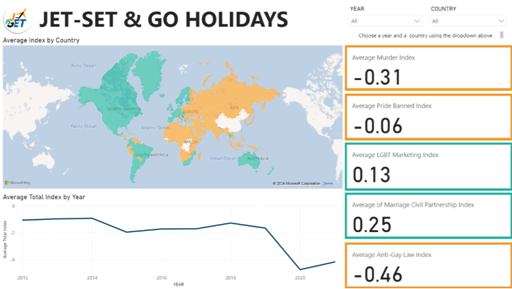
It’s clear how well visuals and data can work together to tell a story – the challenge was to explore LGBTQ+ inclusivity on a global scale. The map and color-coded indexes make it easy to see key insights, while the filters and trend chart add depth and interactivity. It’s a reminder that thoughtful design can make complex data feel accessible and engaging.
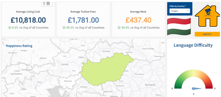
The aim was to produce a guide to students that highlights some of the most important factors when deciding where to move abroad. This dashboard is straightforward and visually appealing, with key numbers front and centre for quick takeaways. The map gives context to the country, while the flag and icons add a personal touch. The use of comparisons to global averages makes it easy to spot where Hungary stands out, and the language difficulty gauge is a nice, unexpected addition. It’s a well-balanced mix of practical info and engaging visuals.
Navigating any Data Vis tool for a high-stakes client, with sky-high expectations can be daunting. You’re staring at a blank canvas, knowing you need to deliver insights that impress, but where do you start? For many of us, the challenge is not just building the report, but doing it efficiently without sacrificing quality.
The good news? With the right techniques, you can turn those daunting first steps into a well-oiled process. These 10 tips will help you streamline your Power BI workflow, saving time in both development and delivery, while ensuring your reports are polished, professional, and impactful.
1. Leverage Keyboard Shortcuts for Efficiency
Tip: Use shortcuts like Ctrl + Shift + F to open the Fields pane and Ctrl + Shift + C to copy visual formatting across visuals. Keeping your desktop view clean by showing only the necessary tabs can significantly enhance your workflow, allowing you to focus on building and refining visuals efficiently.
Why It Works: Shortcuts reduce reliance on menus, speeding up repetitive tasks and improving productivity.
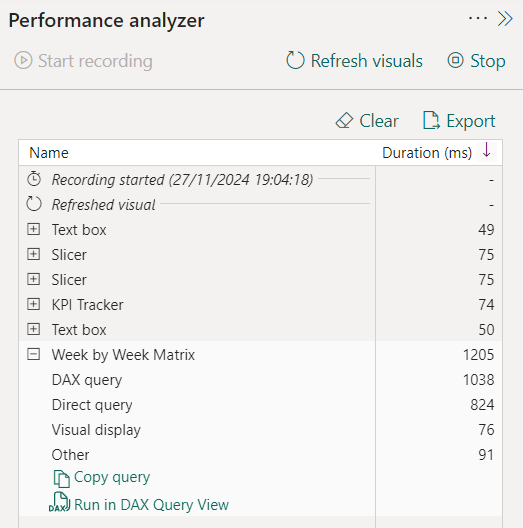
2. Use Performance Analyzer to Optimize Reports
Tip: Identify bottlenecks with the Performance Analyzer, which reveals rendering times and query details. To go the extra mile, copy your query into DAX Studio, to analyse the slowest queries, calculations, and statements within your dashboard.
Why It Works: Pinpointing slow visuals or inefficient DAX measures helps you optimise performance for faster report delivery.
3. Utilise Query Dependencies for Troubleshooting
Tip: The Query Dependencies view provides a clear, visual map of how tables, queries, and data sources are interconnected. It simplifies diagnosing issues by highlighting problem areas in the data flow and helps you understand relationships in complex models. This saves time by allowing targeted adjustments without disrupting downstream queries.
Why It Works: Visualising relationships saves time spent on debugging and ensures smoother model management, especially if you are new to or unfamiliar with the data model you are working on.
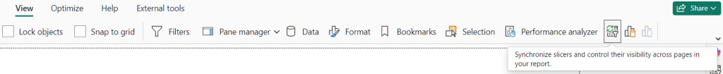
4. Sync Slicers Across Pages
Tip: Sync slicers to apply filters across multiple pages with one click.
Why It Works: It ensures a smoother user experience by allowing filters to persist across pages, reducing friction for users navigating complex reports.
5. Create Templates for Consistency
Tip: Design templates with pre-configured layouts, themes, and formatting for standardising reports. Saving a theme in Power BI can also be shared with your stakeholders, allowing you to drive brand identity across an entire organisation.
Why It Works: Templates ensure uniformity and save time, especially when building reports with recurring structures.
6. Use Pre-built DAX Function
Tip: Simplify calculations with functions like TOTALYTD(), DATESYTD(), and USERELATIONSHIP(). These are particularly powerful when referencing related surrogate keys (SKs) from large FACT and DIM tables.
Why It Works: Pre-built functions reduce the need for custom code, minimizing errors and accelerating development.
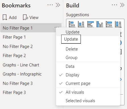
7. Simplify Views with Bookmarks
Tip: Use bookmarks to toggle between different report views, such as a high-level summary and a detailed analysis. You can also create interactive elements, like buttons, to switch between views seamlessly, enhancing user experience and navigation.
Why It Works: Bookmarks enable dynamic storytelling, allowing users to explore data from multiple perspectives without overwhelming them. They also save time by reducing the need to replicate visuals for different scenarios, keeping your reports streamlined and efficient.
8. Speed Up Data Loads with Incremental Refresh
Tip: Refresh only new or updated data using incremental refresh instead of reloading the entire dataset. Why It Works: Incremental refresh significantly reduces load times, especially for large datasets.
9. Stick to a Star Schema for Better Performance
Tip: Separate fact and dimension tables in a star schema, and avoid many-to-many relationships. Why It Works: A simpler schema improves query performance, making development and debugging more efficient.
10. Streamline Collaboration with Delivery Frameworks
Tip: Develop delivery frameworks with pre-defined visuals, filters, and formatting tailored to stakeholders’ needs. For example, you can create a 16:9 template in Microsoft PowerPoint, save it as an .svg file (optimised for picture quality), and import it into Power BI as a report background. This approach aligns visuals with stakeholder expectations and streamlines the design process. Why It Works: These frameworks simplify report finalisation and foster alignment across teams, ensuring faster, professional-grade delivery.
By incorporating these tips into your Power BI workflow, you’ll accelerate development and deliver polished reports with ease. Power BI is a robust tool, and mastering these efficiencies can elevate your data storytelling.
Imagine you’re a busy executive or consultant, moving from one client meeting to the next, and you’re already late. You’re crammed shoulder-to-shoulder on the Central Line at rush hour, and there’s no time to open your laptop, let alone dive into a full Power BI dashboard to check whether your business is thriving or facing challenges.
In a world where attention spans are at an all-time low and we’re all fighting the Monday morning brain rot of doomscrolling, you need quick, actionable insights, right at your fingertips. This is where mobile-friendly Power BI reports become invaluable. By tailoring your dashboards for smaller screens, you ensure your data is accessible, digestible, and impactful wherever and whenever it’s needed.
In this blog, we’ll explore best practices for crafting mobile Power BI reports that deliver clarity and usability, even on the go.
How to start a Mobile View
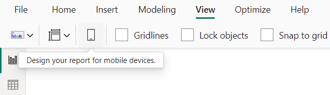
Designing for mobile begins with using the dedicated layout in Power BI Desktop – a tool specifically designed to help you create reports optimized for smaller screens.
How to Access the Mobile Layout
Switching to the mobile layout is simple:
Navigate to the View tab in Power BI Desktop.
Click the Mobile Layout button, and voila, you’re working in a canvas tailored for mobile devices.
But do not fear! Switching to mobile won’t alter your desktop report layout, it provides a separate space to rearrange visuals specifically for mobile users. Here are my three pillars for using the Mobile Layout:
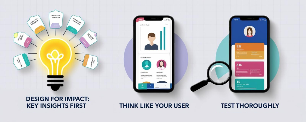
1. Design for Impact: Key Insights First
Mobile screens have limited real estate, making it essential to focus on what truly matters. Here’s how:
Aspect Ratios Matter: Transitioning from a desktop’s 16:9 layout to the mobile-friendly 9:16 ratio requires thoughtful design. Prioritise visuals that provide maximum value.
Combine and Simplify Visuals: Layering visuals, for example combining total revenue with a sparkline for trends, saves space and delivers more context in one glance.
Colour and Contrast: Use high-contrast colours to highlight key metrics and guide users’ attention. Let your most important KPIs pop, ensuring the data tells its story immediately.
Font Size Matters: Stick to font sizes between 12–14 points. This ensures readability without wasting precious screen space.
Declutter: Remove gridlines, simplify legends, and eliminate excessive labels to keep the report clean and professional. A favourite hack I like to work with here is to duplicate any visuals that need tweaking, and then hiding them in the desktop view by sending to back in the format pane.
2. Think Like Your User
Put yourself in your users’ shoes. What do they need, and how will they interact with your report?
Context Is Key: A sales manager might need quick KPI snapshots, while a field worker may require an interactive map. Tailor the experience accordingly.
Make It App-Like: Users are accustomed to intuitive mobile apps. Design your report to feel equally simple, with touch-friendly elements and minimal steps to access key insights.
Guide Their Journey: Include prompts such as “Flip your device horizontally for more details” or buttons that direct users to the full desktop report for in-depth exploration.
Maximise Interactivity: Use bookmarks, drill-throughs, and navigation buttons to create a seamless, engaging experience. For example, a navigation button labelled “See Regional Performance” can quickly guide users to detailed insights.
3. Test, Test, Test
No design is complete without thorough testing, and this step cannot be overlooked.
Simulators Aren’t Enough: While Power BI Desktop’s mobile layout is helpful, it’s not a bulletproof view of how your report will behave on an actual device.
How to Preview on Real Devices:
Publish the report to the Power BI Service.
Open the Power BI Mobile app to interact with the report as your users would.
Testing Checklist:
Are all visuals clear and legible without zooming?
Do buttons, slicers, and other interactive elements work as expected?
Is navigation intuitive and fluid?
Does the report load quickly, even on slower mobile networks?
Testing ensures that your mobile report is not only functional but also delivers an excellent user experience, whether it’s accessed on a bustling commute or during a quick coffee break between meetings.
Conclusion
Designing mobile-friendly Power BI reports isn’t just a technical adjustment, it’s about ensuring your insights are always within reach, no matter where or how they are accessed. By focusing on impactful metrics, optimising readability, and enhancing interactivity, you can create a seamless experience that empowers decision-makers to act with confidence.
The best mobile reports don’t replicate desktop views, they are thoughtfully tailored to suit the unique demands of smaller screens and busy users. Through careful testing and iteration, you can refine your designs to deliver maximum value without compromising usability.
As businesses continue to rely on data-driven decisions, mobile reports are becoming an indispensable tool for agility and accessibility. Whether you’re creating a dashboard for a sales executive or a team in the field, these best practices will help you transform your reports into a dynamic, user-friendly asset.
Now it’s your turn. Why not try building a mobile layout in Power BI today?
Colour has the power to tell a story at a glance, but it’s also one of the easiest ways to mislead or confuse in data visualisation. When used thoughtfully, colour reveals patterns, clarifies relationships, and helps readers make sense of the data. However, poor colour choices can obscure key insights or distort the message entirely.
Understanding how to use colour wisely is a skill every data storyteller needs. In this post, we’ll explore the fundamentals of using colour effectively in data visualisation. From selecting the right palette to ensuring accessibility and consistency, these best practices will help you make your visuals not only look better but work better.
The Psychology of Colour
Colour is deeply ingrained in human psychology, influencing how we perceive and respond to information. For instance:
Red often conveys urgency or danger, linked to its associations with blood and fire.
Green is widely seen as calming, evoking safety and abundance, a remnant of a time when lush greenery signalled a reliable source of food and shelter.
However, the meaning of colours isn’t universal. Cultural and contextual differences play a significant role in how colours are interpreted:
In Western cultures, blue is viewed as professional or calming, while in parts of Central and South America, it may symbolise mourning.
Red, which can signify good fortune in China, might represent financial losses in a Western business report.
Being mindful of your audience and their cultural context ensures your colour choices resonate appropriately.
The Basics of Colour Selection
When choosing colours for data visualisation, the goal is clarity and speed. The “10-second rule” suggests viewers should grasp the key message of your visual in under 10 seconds. Your colour choices should guide their focus instinctively.
Contrast High contrast ensures your data is easy to read and interpret. For example:
Use dark text on a light background or vice versa for optimal legibility.
For line charts or bar graphs, contrasting colours can help distinguish data points and highlight trends.
Striking the right balance between clarity and simplicity is essential. Too much contrast can overwhelm, while too little can obscure key details.
Highlighting with Colour A good rule of thumb is to use a single “highlight” colour for the most important data point, keeping secondary information in neutral or muted tones. For example:
In a sales report, you might use green to represent revenue, while supporting metrics like budget or costs could be displayed in shades of grey or blue.
This helps your audience immediately focus on what matters most without feeling overwhelmed.
Less is More Treat colour like toppings on a pizza, less is often more. Stick to three main colours to avoid confusing or overwhelming your audience. A minimal colour scheme not only looks clean but keeps the focus on the data itself.
Gradients or shades of a single colour can also help communicate variation without introducing unnecessary complexity. For example, visualising sales data across multiple products and time periods can remain clear when a single colour family is used with varying intensities.
Consistency is Key
“Small disciplines repeated with consistency every day lead to great achievements.” – John C. Maxwell
Consistency in colour isn’t just about aesthetics, it’s about guiding the viewer’s eye and reducing cognitive load. Here’s how to achieve it:
Use brand colours wisely: For example, if your brand colour is blue, you can use it for positive metrics, titles, or key information to create cohesion across visuals.
Set clear rules: Assign specific colours to metrics (e.g. green for growth) and stick to these rules across your report.
Avoid the ‘Christmas Tree’ effect: Overloading visuals with too many colours, or many uses of the same colour, can distract and overwhelm. Instead, use accent colours sparingly for maximum impact.
A is for Accessibility
Colour should enhance your visuals, not overwhelm them. Importantly, it must also be inclusive and accessible to all audiences.
Design for Colourblind Users Around 8% of men and 0.5% of women have some form of colour vision deficiency. To ensure accessibility:
Use tools like ColorBrewer or colourblind-safe palettes in software like Power BI.
Opt for combinations that are easy to distinguish, such as blue and orange, instead of red and green.
Additionally, consider offering a “colour-blind mode” in interactive reports. This not only improves inclusivity but also highlights your technical skills if you’re coding visualisations.
Layer with Patterns and Labels Colour alone shouldn’t carry the meaning. Adding patterns, textures, or clear data labels ensures your visual is accessible to everyone, regardless of their ability to perceive colours.
Run Accessibility Checks Test your visuals by temporarily desaturating them to black and white. If the data remains clear and interpretable, you’ve achieved accessibility.
Wrapping It All Up: Colour in Data Visualisation
Colour is a powerful tool, but its impact lies in thoughtful application. To summarise:
“One bright colour = one big impact”: Use vibrant colours sparingly to highlight key points.
“Use contrast wisely”: Ensure sufficient contrast for legibility without overloading the visual.
“Let data drive your palette”: Choose colours that support the story your data is telling.
Take action: Limit your colour palette, maintain consistency, and check for accessibility.
Finally, don’t be afraid to experiment. Test your colour schemes with your audience, gather feedback, and refine your approach over time. By following these principles, you’ll create visuals that are not only eye-catching but also effective and inclusive.
In the first post of this series, I walked through the basic ideas of what constitutes a graph, and in the second post I discussed a particular kind of graph called a directed acyclic graph (DAG), providing a handful of examples from the world of data engineering along with an attempt to disambiguate – and expand – the meaning of what a DAG is.
To briefly recap the important points discussed in this series so far:
A graph consists of one or more nodes.
Nodes are related to other nodes via one or more edges.
Nodes that that can reach themselves again (in a single direction) indicate the graph has a cycle.
A given edge can be directed or undirected.
Nodes and edges can haveattributes, including numerical attributes.
Graphs without cycles, with only directed eges, are called directed acyclic graphs (DAGs).
Hierarchies are DAGs in which each node only has a single predecessor node.
In the following post, we’re going to discuss hierarchies in detail. We’ll look at a few examples, discuss additional attributes that emerge from the definition of a hierarchy, and we’ll introduce an initial data model that can accommodate many different types of hierarchies.
Hierarchies
As indicated in the last post and summarized above, a hierarchy is essentially a DAG in which any given node has a single predecessor node (except for the root node, which has no predecessor). Given this constraint, predecessor nodes are most commonly referred to as “parent” nodes (i.e. with the analogy of a parent having one or more children). Successor nodes are thus also usually referred to as “child” nodes. We’ll stick with this convention for the rest of the series, given its wider adoption within BI vernacular.
(Note: despite the ideal case a hierarchy only ever consisting of child nodes with a single parent node, there are real-world edge cases where a given node can potentially have more than one parent node. Such cases are the exceptions, and they need to handled on a case-by-case basis. For our purposes, to manage scope of this overall series of posts, and in light of the expected cardinality of dimensional modeling (i.e. many-to-one from fact table to dimension tables), we’re going to move forward with the expectation that any/all hierarchies should always respect this relationship, i.e. a child node only ever having a single parent node.)
It’s also worth noting that hierarchies can be considered an instance of a “tree” data structure (a directed rooted tree, more specifically), which is a formally defined data structure from graph theory. While graph theory is rarely invoked in discussions of business intelligence, it is important to note that the tree analogy does indeed carry over, with terms like “root nodes”, “branches” and “leaf nodes” frequently used, which we’ll discuss later. (So just be mindful that you’re likely to run into mixed metaphors when discussing hierarchies.)
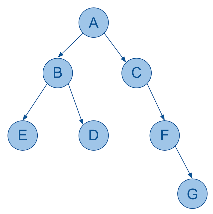
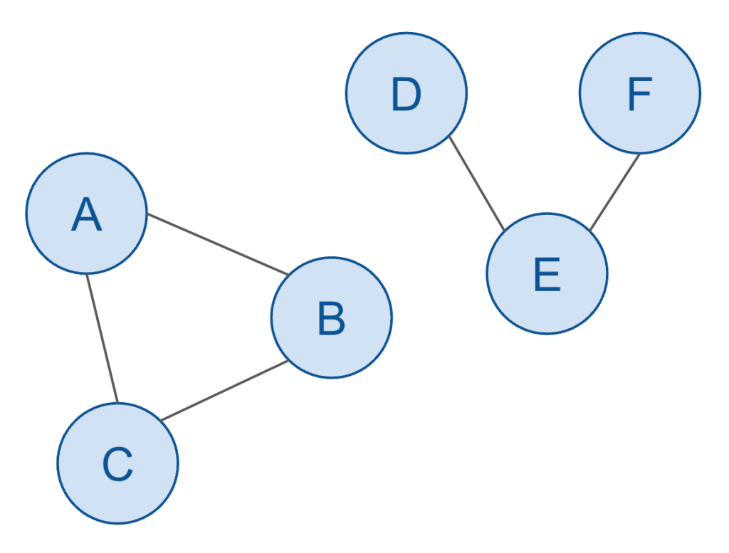
So, here’s a basic visualization of a hierarchy:
Hierarchy example… of alphabet soup
As you can see, it’s still very much a graph (and indeed a DAG) with:
seven nodes
six edges (directed)
no cycles
each node only has a single parent
So far so good.
I mentioned earlier that even though hierarchies have more constraints, i.e. they’re more limited in what they can represent compared to generic graphs, they nonetheless yield additional attributes. What do I mean by that?
Consider the following two points.
Firstly, because I have:
a single starting point (i.e. the very first parent node),
only directed edges,
no cycles,
a hierarchy therefore allows me to measure the “distance” of any node in the hierarchy by how many edges away from the starting node (or “root node” as we’ll call it) it is. This measurement is typically referred to as which level a particular node is on (analogous to measuring how high up in a building you are by what level you’re on. And much like the British/American idiosyncracies around which floor constitutes the “first” floor, as well as the differences among programming languages regarding how arrays are indexed, i.e. starting at 0 or 1, you’ll also have to decide whether you index your root node at level 0 or 1. I don’t have a strong opinion and am guilty of having used both for no particular reason. I’ll try my best in these posts to arbitrarily stick with one convention, i.e. identifying the root node at level 1.)
Note that level is a value that can be derived from the data itself, and thus is slightly redundant when persisted as its own column – but such derivation introduces unnecessarily complex logic and performance headaches, and thus benefits from being persisted as part of transformation logic in a data pipeline.
Also note that this level attribute can be considered a node’s “natural” level, but that business requirements may dictate treating a node as though it has a different level. A more detailed discussion on such cases can be found in the 5th post of this series, where unbalanced and ragged hierarchies are addressed.
It’s also worth noting that you can, of course, measure the number of edges between any two nodes in a generic graph, but unlike with hierarchies, there’s not a single value for level per node but rather N-1 such values, i.e. since you can measure the number of edges between a given node and all other nodes in the same graph. Storing such information for all nodes introduce exponential storage requirements, i.e. O(n²), and offers very little technical or business value. Hence level is a fairly meaningless attribute in the context of generic graphs or DAGs.)
Secondly, because you can now refer to multiple “sibling” nodes under a single parent, you can describe the sort order of each sibling node. In other words, you define a particular sort order for all the related sibling nodes under a particular parent node. (This is another example of an attribute that is meaningful for hierarchies, but really doesn’t make much sense in the context of a generic graph or DAG.)
A classic example that demonstrates the value of a defined sort order attribute of hierarchy nodes are financial statements. (Just imagine in the following image of all of the lines were presented in a completely random order. It would make no sense at all.)
Part of of a hierarchical P&L structure
Financial reports are a very common use case in the world of BI, and it’s clearly extremely important to ensure that your reports display the various lines of your report in the correct order, defined by the sort order of each node in your financial statement hierarchy.
It’s worth noting that this sort order attribute doesn’t have a canonical name in the world of BI as such. But for a variety of reasons, my preference is “sequence number” (SEQNR as its column name), so we’ll stick with that. (Some data engineers / BI developers might refer to it as “ordinal position”, FYI).
(Also, for folks new to hierarchies, you might find it a worthwhile exercise to analyse the financial statement structure above as a hierarchy: How many nodes does it have? How many edges? How many levels? How many child nodes per parent? How might you actually model this data in a relational structure? We’ll come back to this in a bit.)
Two more points I’d like to make, as we work towards a generic/reusable data model for hierarchies:
This should be obvious, but there are many different types of hierarchies, such as (in an enterprise context): profit centre hierarchies, cost centre hierarchies, WBS structure hierarchies, cost element hierarchies, financial statement hierarchies, and the list goes on.
A particular hierarchy type might have multiple hierarchy instances. For example, a time dimension is actually a hierarchy, and almost all large enterprises care about tracking metrics along both the calendar year as well as the fiscal year, each of which is its own hierarchy.
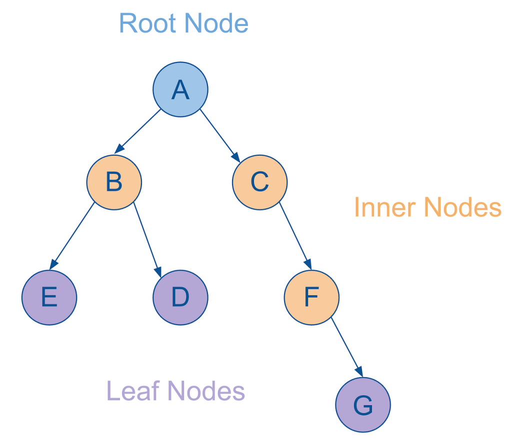
And lastly, let me further extend the tree analogy introduced previously:
As mentioned, the starting node is referred to as the root node.
Any nodes that have parent and child nodes are called intermediate or inner nodes.
Any nodes that have parent but no child nodes themselves are called leaf nodes.
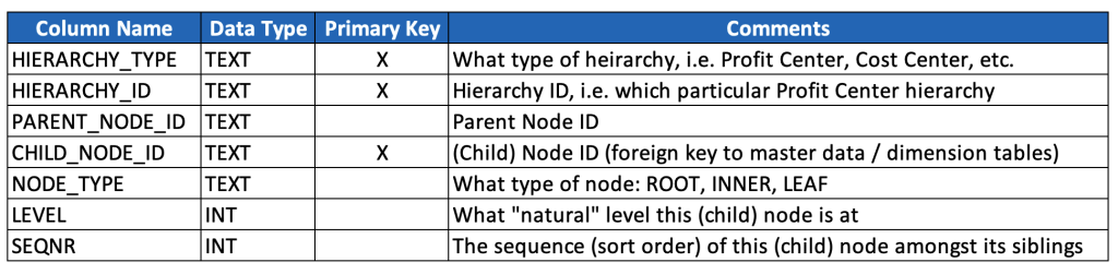
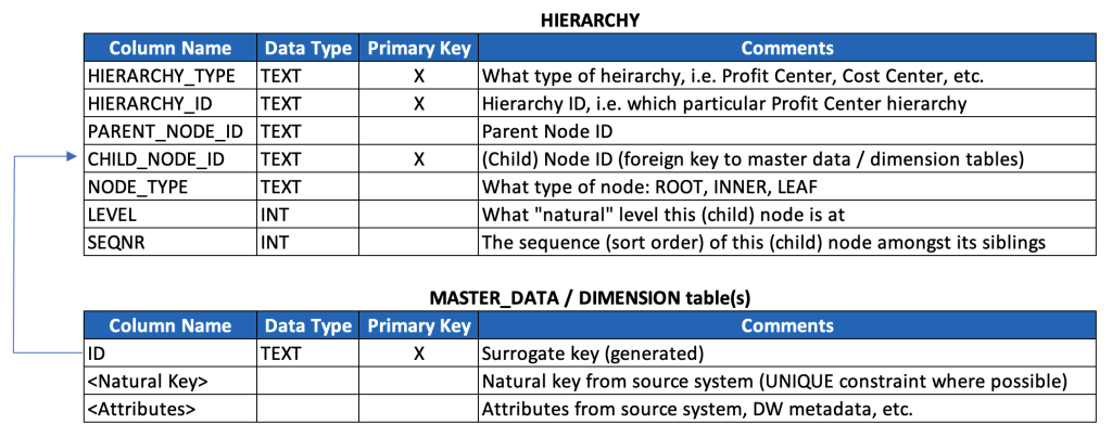
Ok, let’s now look at a basic, generic and reusable data model for storing hierarchies. This is the beginning of the discussion, and not the end, but it gives a strong foundation for how to accommodate many different types and instances of hierarchies.
Rather than write the SQL, I’m just going to provide a poor man’s data dictionary, especially given that your naming conventions (and probably also data types) may well differ. (For a detailed review of SQL that may help you ingest, model and consume hierarchies, see the 6th post in this series.)
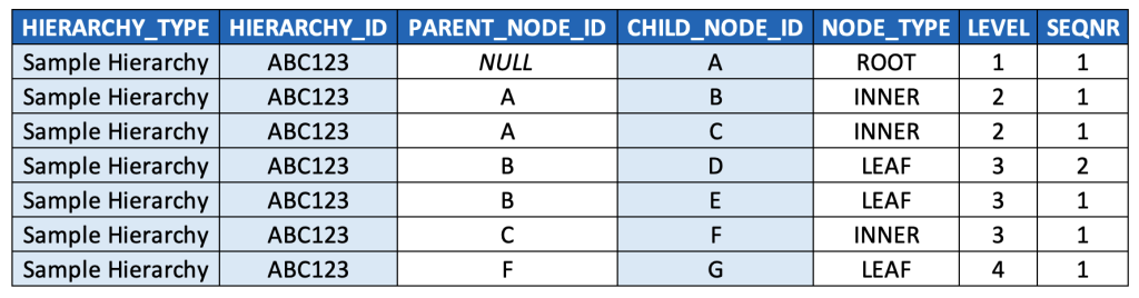
Here below is what the example hierarchy above would look like in this model (key fields highlighted):
It’s worth taking a moment to talk through the model and the data a bit.
This model denormalizes three levels of data: hierarchy types, hierarchy instances, and hierarchy nodes, and it also embeds a text description of hierarchy types (instead of a typical key/text pair). This is based on a pragmatic model that has been used successfully at multiple very large enterprises, but it’s worth considering whether your use case warrants a more normalized model. (And in either case, this model excludes separate language-dependent text tables that might be relevant if implementing a data model for a multinational organization, so just keep such tables in mind should you find yourself on such a project.)
The primary key is a compound key based on these three levels. It’s worth noting that the CHILD_NODE_ID and HIERARCHY_ID should almost always be populated with generated surrogate keys, at least when data is ingested from multiple source systems. It’s also worth noting that it’s probably better to create a unique constraint against these three fields, and then generate a separate, single surrogate primary key (which will simplify later data modeling discussions). These details are left out from the above model for simplicity & illustration purposes.
I’d suggest playing around a bit with some sample data, and sorting by the different columns, to familiarise yourself even more with this data model. For example, you could sort by NODE_TYPE to quickly find all the INNER nodes and LEAF nodes. You could sort by LEVEL and then SEQNR to “read” the hierarchy as you would with its visualised equivalent, i.e. top-to-bottom, left-to-right.
Note that root nodes are defined as those records for which PARENT_NODE_ID is NULL. This is a commonly accepted convention, especially for query languages that can traverse parent-child hierarchies natively (such as MDX, which we’ll come back to), so I’d highly suggest adopting it (especially if you’re modeling in a strictly OLAP context), but there’s clearly no “formal” reason, i.e. from relational theory or anything else, that requires this.
If this were a data model for a generic graph or even a DAG, we would have to include PARENT_NODE_ID as part of the primary key, since a node could have more than one parent. However, since hierarchy nodes only have a single parent node, we don’t need to do this, and in fact, we don’t want to do this (as, from a data quality perspective, it would let us insert records with multiple parent records, which breaks the definition set forth previously for hierarchies, and could lead to incorrect results in our BI queries by inflating metrics when joining hierarchies to fact tables due to M:N join cardinality instead of M:1).
SEQNR values might be a bit confusing at first glance. While every row is populated a value, the values are only meaningful amongst sibling nodes. Also, note that the typical convention for populating SEQNR is to restart its numerical sequence for each set of siblings nodes, and thus values are often duplicated (i.e. re-used / reset for each set of sibling nodes).
It’s technically possible to implement a contiguous sequence that spans all records, but that approach is usually avoided as it introduces another (arguably worse) form of confusion: it disregards the recursive relationship that exists between parent/child nodes.
It’s also worth noting that in some cases, the only sort order that really matters is the inherent alphanumeric sort order (of the node IDs themselves, or their associated text descriptions), such as with the time dimension (so long as any alphanumeric representation is padded with zeroes so that the string “11” doesn’t appear before “2”, for example. For more on this, see the ISO 8601 standard.)
Before I forget to mention, you might hear this parent-child structure referred to as an “adjacency list”, which is another term from graph theory. Technically, an adjacency list maps a single node to all of its adjacent nodes within a single record (which could be accomplished by packing all adjacent nodes in an ARRAY or JSON data type). In practice though, folks often refer to the parent/child data model above as an adjacency list, even though each child node gets its own row. So just keep that in mind in case you hear folks use the term “adjacency list” somewhat casually.
Extending the Model
The basic hierarchy data model we’ve reviewed above can clearly accommodate multiple hierarchies of multiple different types, and after a bit of reflection it becomes obvious that each hierarchy type likely corresponds with its own dedicated master data and/or dimension with its own attributes.
So, we’ll extend our model with one additional generic table as a kind of placeholder for any/all dimensions that correspond with each hierarchy type that we’re persisting (keeping in mind that we may need to further extend the model to accommodate additional semantics around multilingual texts, currencies, units of measure, etc.).
In Summary
We’ve now gone through graphs, DAGs, and hierarchies, and we’ve walked through a basic, scalable data model for parent-child hierarchies and discussed some of the nuances of this model.
In the next post, we’ll review an alternative way to model hierarchies: the level hierarchy model. We’ll compare tradeoffs between parent-child and level hierarchy models, indicating when the level hierarchy might be more appropriate, and review a particularly helpful SQL query for “flattening” a parent-child hierarchy into a level hierarchy.
Epilogue – Disambiguation
After reviewing this series of posts as a whole, it occurred to me that it’s worth disambiguating various terms, concepts and conventions that I adopt throughout these posts to hopefully introduce a bit more clarity around the content of these posts but also the data engineering and BI industry more generally.
I also find myself taking a few shortcuts and liberties that fall short of academic rigor, that I think would be helpful to call out.
Hierarchies
This series of posts is, primarily, about hierarchies found in business intelligence, i.e. data structures typically associated with dimensions that are used to aggregate KPIs/metrics at difference levels of granularity associated with the corresponding dimension. We could call these BI hierarchies.
As noted in the beginning of this post, we’ve constrained BI hierarchies specifically to those that follow the strict definition of “directed root tree”, i.e. no multi-parent scenarios. It’s worth noting that there are many cases of data models and datasets that still meet this definition without strictly being treated as BI hierarchies, i.e. are made available for reporting without being specifically (or perhaps “frequently”) leveraged for rolling up / drilling down KPIs in a BI context, but nonetheless remain relevant data for reporting. We could call these technical hierarchies, i.e. data structures that meet the technical definition. (More on examples of such hierarchies discussed in the next post.)
As noted in the prior post and next post (i.e. posts 2 and 4), there are many cases of data and/or capabilities in software that are called “hierarchical” without reference to BI, and without meeting the technical definition of a directed rooted tree.
One example provided was the role-based access control (RBAC) of most databases. The structure of role inheritance makes it often, but not always, strictly hierarchical (i.e. given multi-parent inheritance as a possiblity).
This is also true with time data (time dimension). Time data is very often used as a BI hierarchy, for drilling down and rolling up. But, this dimension/hierarchy is often modeled with week attributes, and if you think about, a calendar week can belong to more than one parent month, so casual use of “hierarchy” in the context of “month > week > day” relationships doesn’t quite meet the strict definition. I discuss this again in the next post.
The point here is not to over-analyze semantics, but rather just to indicate the latent ambiguity of language, in this case specifically regarding hierarchies. The best thing you can do is just stay mindful of context, and determine when specific senses/meanings of the term is intended. And the worst thing you can do is be dogmatic about a single definition and impost it in the wrong context.
This series of posts is primarily about BI hierarchies, but given some fascinating insights into more generic hierarchical data structures, I’ve decided to include additional content around what I’m calling “technical hierarchies” above. You’ll see what I mean in subsequent posts, and hopefully find the content interesting!
Parents and Children
We’ve discussed parent-child hierarchies, which may lead to some confusion when data modelers discuss “parent tables” and “child tables”. I find it helpful to recognize the following:
A “child table” is a table that has a foreign key (whether formally or informally defined) that points back to the “parent table”, i.e. via its associated primary key.
So, an ORDER table would be the parent of an ORDER_LINE table (and both could be fact tables used in different contexts, from a data warehousing perspective), and the join cardinality would be one-to-many.
A supertype table (say a PERSON table) could be a parent table to multiple child tables (i.e. STUDENT table and FACULTY table). In this case, the join cardinality would be one-to-one (with the child tables storing records optionally, i.e. not all PERSON records have a corresponding CHILD table).
If you give it some thought, you’ll recognize that if you join any two such tables together, you’ll have a parent-child hierarchy (in the “technical” sense), i.e. the primary key of the parent table identifies the parent node, and the primary key of the child table identifies the child node. (Don’t get confused by composite keys, i.e. primary keys made up of multiple columns – just conceptually imagine concatenating them into a new column, so that you had a unique, single column key).
The most common example would be typical dimension/fact table relationships. A single dimension record corresponds with multiple fact records (usually). Thus, if you consider just the dimension foreign key on the fact table (say, something like PRODUCT_ID) along with a generated primary key on your fact table (say FACT_ID), you then have a two-level hierarchy defined by PRODUCT_ID and FACT_ID. Thus, when you decide to aggregate metrics along that dimension, you are implicitly invoking the concept of a BI hierarchy, even if you have no further formal hierarchy levels in scope.
Even in the case of super/subtype relationships, you also have a two-level hierarchy, where each parent node only has a single child node.
Disambiguating a few more things
I tend to use “dimension” and “hierarchy” interchangeably when a dimension consists entirely of a hierarchy (such as with the time dimension itself – it’s a dimension, and it’s a hierarchy). Hopefully this is not confusing, as there are other cases where a single dimension (i.e. a PRODUCT dimension) consist of multiple (snowflaked) tables.
On that note, I tend to use “snowflaking” and “normalizing” interchangeably.
I tend to use “master data” and “dimension” interchangeably, since they both conceptually correspond with something representative of a single, well-understood entity. Obviously, master data tables from multiple source systems may be integrated into a single conformed dimension in an enterprise data warehouse, but I have a bad habit of nonetheless treating the terms as meaning more or less the same thing.
When I use the word “structure” as a noun, it typically means “data model”, which I use whenever I use “model” as a verb. Otherwise “modeling a model” just sounds redundant/confusing.
And for reference, here are links to all of the posts in this series (next up is post #4):
In the first post of this series, I walked through the basic ideas of what constitutes a graph with a simplified example from supply chain logistics.
To briefly recap:
A graph consists of one or more nodes, which are connect to one another via one or more edges.
A graph has a cycle if a node can reach itself by traversing the graph in a single direction.
A given edge can be directed or undirected.
Nodes and edges often represent real-world objects with various associated attributes.
Graphs, nodes and edges can be modeled in relational databases.
A simple graph with two nodes, two directed edges and two undirected edges.
This next post will further flesh out the technical context for hierarchies by exploring a subset of graphs called directed acyclic graphs (DAGs) and disambiguate the use of this term and related concepts.
Directed Acyclic Graphs (DAGs)
This post is not about data pipeline tools as such, but I would say most modern day Data Engineers are at least loosely familiar with the concept of DAGs given its widespread adoption in pipeline orchestration tools like Apache Airflow and Dagster. So, it’s worth providing a more generic/abstract definition that better describes what a DAG is beyond just date pipelines:
A DAG is a graph where each and every edge is directed, and
that has no cycles, i.e. is acyclic
DAGs can be found in many contexts beyond data engineering, which is important to keep in mind. Terminology within IT is often already quite idiosyncratic, so when collaborating with technical colleagues (especially software engineers) just keep in mind that their use of the term DAG very likely means something different than anything specific to data engineering.
That being said, DAGs are found all over the place in the field of data engineering, so it’s worth exploring many such instances before further disambiguating hierarchies as a subset of DAGs (which are themselves clearly a subset of graphs more generally).
Queries
Queries are DAGs. Look at the EXPLAIN PLAN of even the most basic query, and you’ll see that the visualised execution plan is a DAG, where:
Each node is a particular operation (such as join, filter, aggregate).
Each edge visualises how the output of a given operation serve as an input to the next operation.
You can clearly see the direction of each edge indicated by the arrows in the plan visualization, and quite obviously a query plan should never have a cycle*, otherwise it would run endlessly until it was stopped or it hit some physical limit.
*Fun fact: On that same project referenced at the beginning of my first post in this series, I did accidentally create a database view in a system that supported column aliases referencing each other within the same projection, and I accidentally created a recursive cycle, i.e. something like A > B, B > C, and then C > A. Querying the view would consume over a terabyte of memory in milliseconds, which led to some very creative debugging! The engineering team then, thankfully, added code to ensure such cycles were prevented. ?)
Data Lineage
Data lineage, which represents the flow of data across a data pipeline, is also a DAG. (What I find interesting to note is that in the case of data lineage, each edge represents a particular operation, and each node represents data. This is the opposite of a query plan, where each edge represents data, and each node represents an operation).
Data Pipelines
Data pipelines are, rather obviously, DAGs.
Gantt Charts
Gantt charts? Aren’t Gantt charts something from project management? Yes, but they’re also used to visualise query plans by displaying the time each operation takes within a query execution plan, by expanding the length of the node to represent the amount of time it takes.
(Side tangent – I’ve always wanted a dynamic Gantt chart visualisation for query plans, where instead of being limited just to a single metric, i.e. time (represented by bar width), I’d have the choice to select from things like memory consumption, CPU time, any implicit parallelization factors, disk I/O for root nodes, etc… any product managers out there want to take up the mantle?)
Relational Data Models
Okay, so, cycles can be found in some real-world relational data models, but even so, all relational data models are directed, and many are acyclic, so I decided to include them here.
Entities are nodes.
Primary/foreign key relationships are the edges.
The direction of the directed edges are from primary keys to foreign keys.
Clearly large enterprise data models with multiple subject areas can consist of multiple sub-graphs.
And if you’re in the mood for a bit of nuance, it’s absolutely fair to refer to the data model itself (i.e. the metadata) as a DAG, and separately calling out the data itself also as a DAG (i.e. the records themselves and their primary/foreign key relationships).
Hierarchies
Hierarchies are DAGs? Yes, hierarchies are DAGs (and DAGs are graphs – but not all graphs are DAGs – and not all DAGs are hierarchies. In fact, most arent.) Hierarchies will be introduced and discussed in much more detail in the next post, but to give a technical description – a hierarchy can be though of as a DAG where any particular node only has a single predecessor node (often called a “parent” node).
The reality that you should be aware of is that the use of the term “hierarchy”, like most terms in any human language, is often used with a certain amount of ambiguity, which can be frustrating in a technical context when precision is important.
One common example (of many) that illustrates this ambiguity is usage of the term “hierarchy” when describing how database roles in role-based access control (RBAC) can be setup. Consider this language from Snowflake’s documentation around their RBAC model (which is comparable to language from most database vendors with an RBAC model): “Note that roles can also be assigned to other roles, creating a role hierarchy.”
Consider the following diagram from Snowflake’s documentation that, at first glance, does look like a hierarchy:
If you look closely, however, you’ll see that Role 3 inherits two different privileges, which means that this structure, technically speaking is not strictly a hierarchy, but rather is a DAG, since, as we just mentioned above, hierarchies are DAGs for which a given node has only one predecessor node (and in this case, Role 2 has two predecessor nodes).
Now, it’s not really reasonable to say that this categorization is “wrong” because that’s not how language works. The term “hierarchy” means different things in different contexts. However, given that Snowflake is often a component in a larger BI landscape, it is important to disambiguate different senses or meanings of terms like “hierarchy”. In the case of RBAC, use of the term “hierarchy” is short-hand for “a model that supports inheritance” and has little bearing on the use of the term “hierarchy” when it comes to (dimensional) data modeling of heirarchies in the context of data warehousing and BI.
Summary
This is a fairly quick post to summarise:
DAGs are directed, acyclic graphs
The common use of the term DAG by Data Engineers is usually limited to the code artifacts of many modern data pipeline/orchestration tools, although it’s clearly a much broader concept.
Even within the field of Data Engineering, DAGs can be found everywhere, as they describe the structure of things like: query execution plans, data lineage visualisations, data pipelines, and entity-relationship models.
The terms DAG and hierarchy are often, and confusingly, used interchangeably, despite not representing exactly the same thing. Being aware of this ambiguity can help improve documentation and communication in the context of larger data engineering and BI efforts.
In the next post, we’ll further flesh out the concept of a hierarchy (particularly in the context of BI) including a few examples, a discussion of components of a hierarchy, an introduction to a data model for hierarchies, and a handful of additional considerations.
And for reference, here are links to all of the posts in this series:
I remember feeling somewhat lost on the first large-scale data warehousing project I was put on in late 2012, early in my consulting career. SAP was trying to win the business of Europe’s largest chain of hardware stores, and thus as an early career consultant in SAP’s Business Analytics division, I was staffed on the team hired to replatform their entire data stack from Oracle onto SAP.
At the time, I’d like to think I was a pretty strong database developer with some pretty sharp SQL skills, but had still never really spent any time digging into the academic rigors of data warehousing as its own discipline.
As the team started discussing this particular company’s various product hierarchies, I found myself feeling a bit lost as folks threw around terms like “root nodes”, “leaf nodes”, “hierarchy levels” and “recursive CTEs”. Nonetheless, I muddled my way through the discussion, ended up successfully executing my first large data warehousing project, and since then have spent many years developing experience, skills and technological contributions to the disciplines of data modeling, data engineering and BI development, including those disciplines as they relate to hierarchies.
So, given that initial confusion at the onset of my career, the subsequent career progression in the way of all things data engineering, and my overall frustration with the lack of high quality content when it comes to understanding how to extract, model, transform, and consume hierarchies, I thought it would be helpful to put together this series of posts as a resource I wish I’d had on that first project - a detailed and systematic introduction to hierarchies with lots of examples, discussion of edge cases, and most importantly – working SQL to dig deep into a subject area that can get quite complex.
So whether you’re earlier in your data engineering career, or if you’re more senior but looking for a refresher, I hope you’ll walk away from this series of posts with a much stronger understanding of hierarchies and how to both model and consume them, primarily in the context of BI.
Goals
Now, there’s an endless amount of blog posts out there that cover hierarchies in the context of data warehousing and BI, so I thought it would be helpful to flesh out my specific goals with this post that I feel haven’t really been met by most of the other content out there.
So, in no particular, the goals of this blog series include:
Simplification — My personal opinion is that most authors over-complicate discussions of hierarchies by glossing over the fundamentals and jumping immediately to complex topics (such as this eyesore demonstrating heterogeneous hierarchies). So, by first focusing on such fundamentals, I hope to then make the more complex aspects of hierarchies much easier to understand.
Technical Context — hierarchies are a subset of “directed acyclic graphs” (DAGs) which themselves are a subset of graphs. In my opinion, a brief discussion of these different data structures helps Data Engineers, especially those lacking a formal computer science background, better understand the technical concepts underlying hierarchies.
Disambiguation — most content I’ve seen on hierarchies muddies the waters between technical theory and real-world use cases, so I hope to more effectively handle those contexts separately before synthesising them. I also hope to deliberately address the vocabulary of hierarchies and disambiguate terms I often see confused, muddled, or simply never addressed (such as the relationship between “parent/child tables”, and “parent-child hierarchies”, as just one example).
Data Model — I’m also not satisfied with the data model(s) most authors have put forth for hierarchies. So, I’ll share a few generic data models (and iterations thereof) that can accommodate the ingestion, transformation and consumption layers of the most common types of hierarchies (parent/child, level, unbalanced, ragged, heterogenous, time-dependent, etc.) along with a brief discussion of the tradeoffs of a schema-on-write model vs. schema-on-read for hierarchy processing data pipelines.
Contents
Here’s is a high-level summary of each of the seven posts in these series:
Post 1: Introducing Graphs
Post 2: Introducing DAGs
Post 3: Introducing Parent-Child Hierarchies
Post 4: Introducing Level Hierarchies
Post 5: Handling Ragged and Unbalanced Hierarchies
Post 6: Hierarchy Review (Data Modeling)
Note that the emphasis in the first five posts is largely conceptual (although some SQL is provided where relevant). A detailed review of relational data models for hierarchies, their corresponding SQL definitions and ETL logic, and a brief discussion on architecture and tradeoffs are addressed specifically in Post 6.
Also note that the query language MDX and its role in consuming hierarchies is touched on at a few points throughout this series of posts, but doesn’t take a central role given its (unfortunate) absence in most “modern data stack” deployments.
Graphs
As noted in the contents above, this particular post will introduce the concept of graphs. The intent is to provide a basic understanding of the generic data structure of which hierarchies are one particular type.
So, let’s start with what we mean by “graph”. In the context of BI, one might immediately think of something like a line chart in a BI tool like Tableau (i.e. graphing data points on a Cartesian plane).
However, the academic concept of a graph from computer science is a separate and distinct concept that describes a data structure that generally represents things and their relationships to one another. More specifically, these things are referred to as nodes (or sometimes “vertices”), and the relationships between nodes are referred to as edges.
Here’s a rather trivial (and abstract) example:
In the above example, there are:
Six nodes
Five edges
Two subgraphs
One cycle
Can you identify each of those concepts just from the visual depiction of this graph?
The nodes and edges should be easy to figure out.
Nodes: A, B, C, D, E, F
Edges: A-B, B-C, C-A, D-E, E-F
The two subgraphs should be easy enough to intuit. The above graph shows that A, B, and C are related, and also the D, E and F are related, but each of these collections of nodes aren’t related to each other. That means each of them constitute their own “subgraph”.
(I’m being a bit informal with my terminology here. The overall dataset is technically called a “disconnected graph” since there are two sets of nodes/edges (subgraphs), also called components, which cannot reach other. We could also call it a graph with two connected subgraphs… but in any case, these details are not particularly germane to the rest of this discussion, and thus the formal vernacular of graph theory won’t be addressed much further since it historically hasn’t played an important role in the discussion of hierarchies nor other related topics in the fields of data engineering and business intelligence.)
And lastly, the one cycle should be relatively intuitive. A cycle is a path through the graph that repeats its edges. In other words, I could put the tip of a pencil on the node A (and moving only in one direction) can trace my way from A > B > C and then back to A. This is called a cycle, and clearly there’s no way to do the same thing from D, for example (hence the second sub-graph does not have a cycle).
In the way of a simple SQL example, we could model this data in a relational database (like Snowflake) as follows:
/* Create tables */ CREATE TABLE IF NOT EXISTS NODES ( NODE_ID TEXT );
CREATE TABLE IF NOT EXISTS EDGES ( NODE_ID_FROM TEXT, NODE_ID_TO TEXT );
Granted, this is an incredibly simple model, and should probably be extended (i.e. to accommodate attributes associated with each node/edges, as well as accommodate multiple graphs), but it illustrates the concept.
Now, one thing worth calling out is the names of the the columns in the EDGES table. The fact that they contain the prepositions “TO” and “FROM” imply a direction, i.e. from the NODE_ID_FROM node to the NODE_ID_TO node. (In practice, these are often also referred to as the “predecessor” node and the “successor” node.)
This illustrates the last concept worth highlighting, i.e. whether we treat a graph as directed or undirected. (Graphs are NOT always directed, and thus these naming conventions are not entirely generic for arbitrary graphs. However, we won’t consider the case of arbitrary graphs much further, whereas directed graphs will play an important role in the rest of our discussion.)
In other words, we sometimes might care about some concept of directionality or precedence, i.e. when a given node should somehow come before another node that it’s related to.
Let’s further flesh these concepts out with a real-world use case from the world of logistics.
Logistics is, “the part of supply chain management that deals with the efficient forward and reverse flow of goods, services, and related information from the point of origin to the point of consumption.” Large supply chains consist of the waterways, railways, and roads that connect cargo vehicles (ships, trains, trucks) all across the globe.
Supply chain networks can be modeled as directed graphs. (Image source)
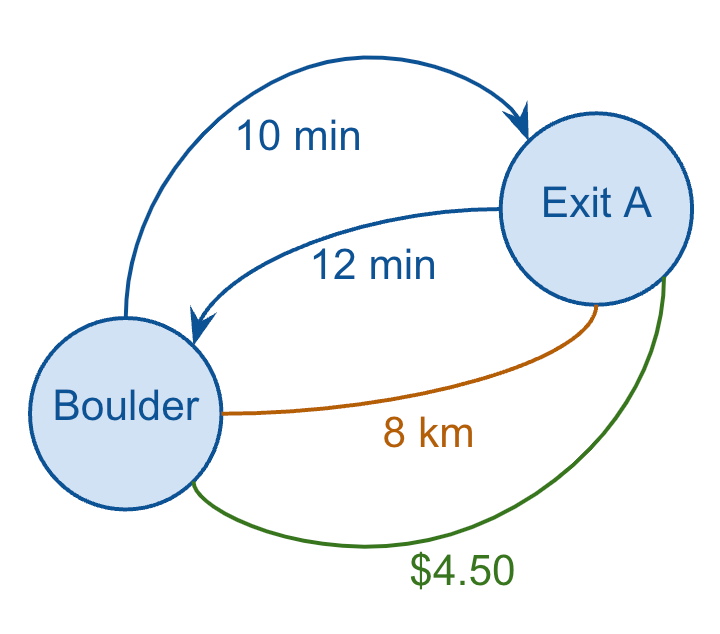
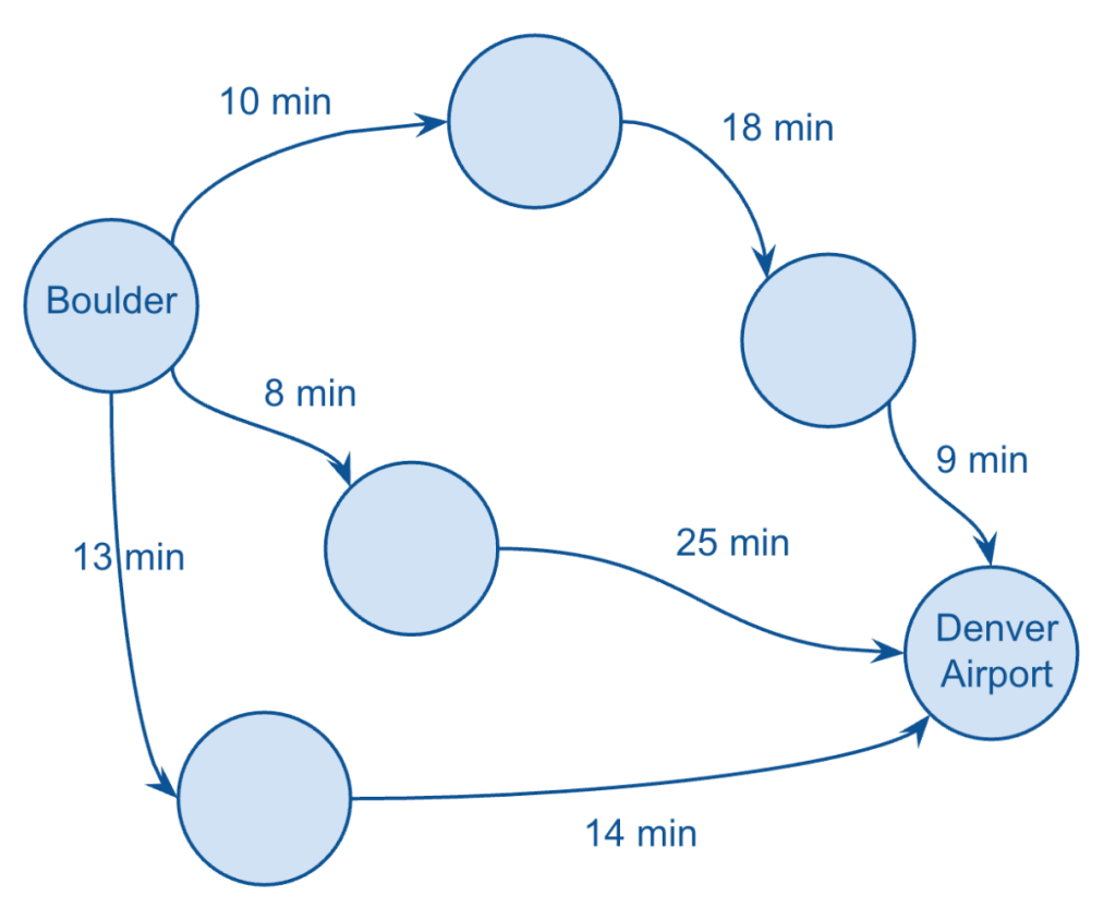
In order to simplify the example, which let’s just consider a single example most of us experience every day: navigating from one point to another using our favorite map app on our phone.
This is obviously a screenshot from my Google Maps app on my phone, showing directions from Boulder to Denver International Airport.
From a data perspective, clearly Google Maps is leveraging geospatial data to visually trace out the exact routes that I could take, but what it’s also doing is figuring out and displaying graph data (which is not actually concerned at all with any geospatial coordinates).
A graph representation of navigation paths
In short, Google Maps is using sophisticated (graph) algorithms to select a handful of routes that are likely to make the most sense for me to choose from, based on time and/or distance.
In my case, I was given three different routes, which I’ve visualised above by just showing the durations for each leg of each route (taking a few liberties here with my version of the graph).
Clearly, Google Maps is summing up the amount of time each leg of each route, and assigning that total value to each route, and displaying them so that I can choose the shortest option.
It’s also showing things like any associated toll road fees (which I’ll just call cost), as well as the total distance.
So, I have three metrics to choose from, for each edge (duration, distance, and cost), and a simple exercise worth thinking about is which of these “edge metrics” should be considered directed vs. undirected:
Duration: directed
Distance: undirected
Cost: undirected
Let me briefly explain.
Duration can often differ in one direction compared to the reverse direction (even though they cover the same route and distance), for example, in cases when there’s a large influx of traffic in one direction, i.e. from suburbs into commercial city centers during the morning rush hour.
Distance between two points on the same leg is pretty much always the same, so that’s an undirected metric (bear with me here — I’m ignoring important edges cases such as construction which might only impact one direction of traffic). And toll road fees (cost) are almost always a function of distance, not time, so those metrics also remain undirected.
So, I can redraw just one leg of one route and show all of these metrics, which also demonstrates how a graph can have multiple edges between the same two nodes (and how some edges can be directed while others can be undirected).
And if I wanted to capture all of this data in my (relational) database, I might model it as follows:
CREATE TABLE IF NOT EXISTS EDGES ( NODE_ID_FROM TEXT, NODE_ID_TO TEXT, DIRECTION TEXT, METRIC TEXT, AMOUNT DECIMAL );
I chose this example not only because it’s intuitive and helps flesh out the key concepts of graphs, but also because it represents a great example of a significant software engineering challenge in a critical real-world use case, i.e. how to optimise supply chain logistics on a much larger scale.
For example, think of all of the manufacturers, shipping ports, distribution centers, warehouses, and stores associated with Wal-Mart across the world, along with the different transport types (truck, train, ship… drone?). Optimising the supply chain of large enterprises is quite clearly a formidable challenge and has played an important role in the development of various graph databases and various graph algorithms.
However, for our purposes we don’t need to go much further down the path of specific technologies or algorithms. It’s sufficient for our discussion of hierarchies to understand the basic of graphs from a data modeling perspective, so let’s briefly summarise the important features of a graph before moving on.
Summary
The important points to keep in mind that characterize graphs include the following:
A graph consists of one or more nodes
Nodes are related to other nodes via one or more edges
Nodes that that can reach themselves again (by traversing the graph in a single direction) indicate the graph has a cycle
A given edge can be directed or undirected
Any set of nodes that can’t reach other sets of nodes are a subgraph.
Nodes and edges can have *attributes associated with them.
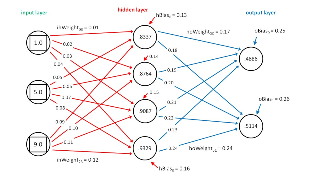
*Such attributes can consist of numerical values used in advanced analytics and algorithms. One such example would be numerical attributes of edges called “weights” and numerical attributes of nodes called “biases” which are leveraged in neural networks, which are the graphs undergirding large language models (LLMs) such as ChatGPT.
(Since this is not a BI use case per se, I’m avoiding the typical distinction between “measures” and “attributes”.)
Numerical attributes of graph edges, or “weights”, represented in the edges of a neural network
Hopefully you’ll find those points simple enough to remember, at it covers pretty much everything you’ll need to know about graphs in the context of data engineering! Again, we’re not particularly concerned with graph algorithms, but rather just the structure of graphs themselves.
In the next post, we’ll impose a few constraints on the definition of a graph to arrive at the concept of a direct acyclic graph (DAG), which will help further motivate our introduction of hierarchies.
And for reference, here are links to the subsequent posts in this series:
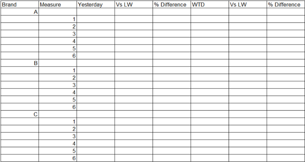
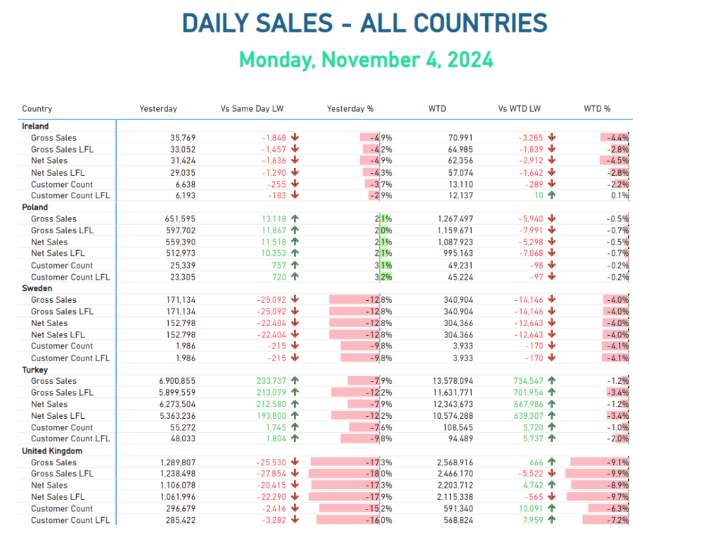
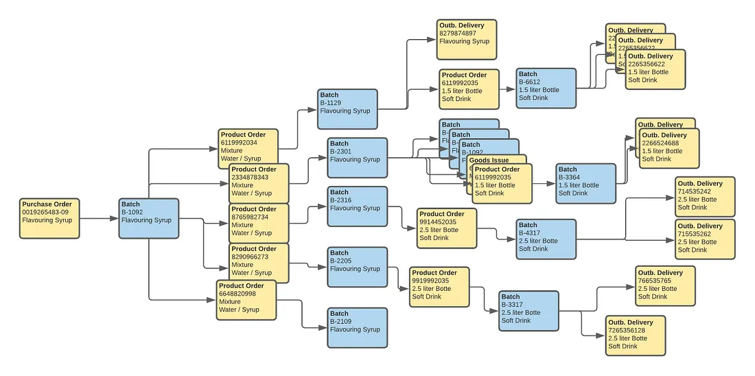
In the world of data viz, creating a clear and informative matrix can often be a daunting challenge. Recently, I was tasked with developing a complex matrix in Power BI to display various brands alongside their key performance indicators (KPIs). This report required six measures for each brand and several time intelligence calculations – such as yesterday’s figures and week-to-date comparisons. Therefore, ensuring a cohesive and consistent visual style became a challenge. Adding to the complexity, I had to ensure that the conditional formatting aligned with that of previous reports for the same client.
In this post, we’ll explore how to build a matrix visual that pivots values to rows, groups them by dimensional hierarchies, whilst performing conditional formatting on our columns, which in this example, are calculated time intelligence measures.
The Challenge
As I began to set up the matrix, I quickly ran into a significant obstacle: Power BI’s default settings only allowed conditional formatting on the values section of the matrix. This limitation became frustrating when I pivoted the data to display KPIs as rows, causing the conditional formatting to be incorrectly applied along the horizontal axis instead of the intended vertical columns. My efforts to create a visually appealing and informative matrix were hampered by these constraints, and I needed to find a way to implement the conditional formatting rules effectively while preserving the integrity of the data presentation.
Exploration of Alternatives
In my quest for a solution, I initially considered hard coding the conditional formatting directly into the time intelligence columns. Using DAX formula, I was able to display up or down arrows based on the calculated values. While this approach worked for the “TW Vs LW” columns, it proved inadequate for the “% change” columns, limiting the overall functionality of my matrix.
Additionally, formatting the values in the DAX query led to performance issues, significantly slowing down the report. I quickly realised that this method did not align with the existing aesthetics of my report pack, further complicating my efforts.
To enhance readability, I explored splitting the matrix into six separate matrices. One for each KPI, with countries as rows and individual measures for each time-period. This solution worked remarkably well for mobile viewing, allowing users to easily access all KPIs, brands, and time periods in a more digestible format when using devices in portrait mode. However, this approach was less ideal for desktop users, as navigating between six matrices became cumbersome and disrupted the seamless experience I intended to deliver.
Breakthrough Solution
After identifying the challenges in presenting a cohesive matrix with effective conditional formatting, I adopted a systematic approach to streamline the data structure and enhance the visual representation of KPIs across different brands.
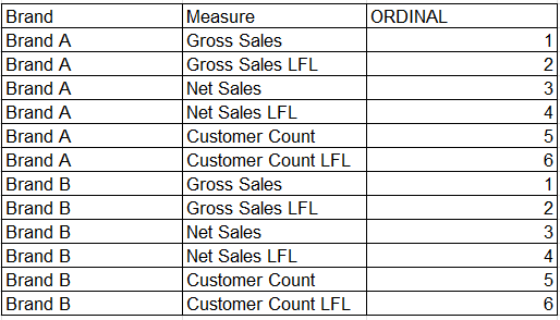
1. Creating the Source Table: I initiated the solution by developing a new source table in Excel. This table organised essential measures associated with various brands, accompanied by an ordinal column to facilitate the correct sequencing of KPIs. This structured layout not only simplified data management but also allowed for straightforward integration with existing data models. For example:
2. Establishing Relationships: To ensure seamless data interaction, I joined this new source table to the store dimension table using a cross-directional, many-to-many relationship based on the brand name. Although many-to-many relationships are generally avoided in Power BI due to potential complexity, they work in this case because the source table’s pre-aggregated KPIs and distinct brand names ensure efficiency and clarity in the model. This configuration maximised flexibility in how data could be accessed and analysed across the two tables.
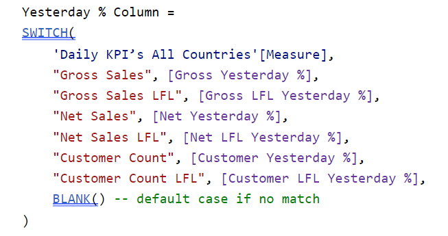
3. Implementing Calculated Columns: Utilising a SWITCH() statement, I created calculated columns that enabled dynamic switching between the measures in the source table and the corresponding measures in the data model. A SWITCH() statement in DAX evaluates an expression against multiple conditions and returns the corresponding result for the first match. This approach allowed for targeted calculations based on specific KPIs while maintaining clarity in data representation.
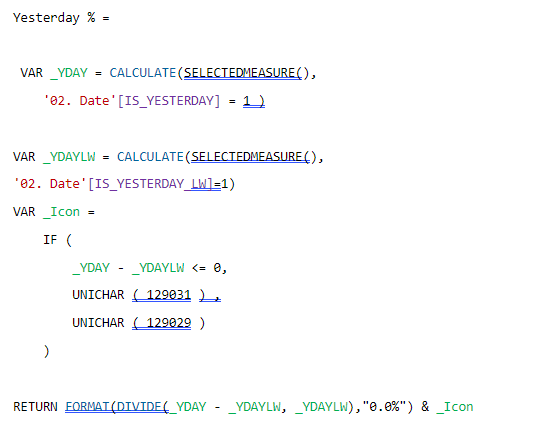
4. Developing Measures: Building on the calculated columns, I developed measures to sum the values required. This was essential for ensuring accurate aggregations, providing a comprehensive view of performance metrics across all brands and time periods. For example:
5. Applying Conditional Formatting: With the measures established, I leveraged Power BI’s built-in conditional formatting rules to enhance visual clarity. This consistency in formatting not only aligned with the existing report pack but also facilitated stakeholders in quickly identifying trends and insights.
This solution not only resolved the immediate technical challenges but also enhanced the overall user experience for those engaging with the reports. The dynamic calculations enabled by the calculated columns ensure that the reports remain relevant and insightful, catering to the business’s evolving needs. Additionally, the focus on consistent formatting facilitates the identification of critical patterns, a fundamental concept in Data-Viz best practices.
Conclusion
By combining thoughtful data modelling and conditional formatting, we can transform raw data into actionable insights, empowering informed decision-making among various stakeholders. As we continue to navigate the complexities of data analysis, this approach serves as a valuable blueprint for future projects, ensuring our reporting remains insightful and adaptable to shifting business landscapes.
I encourage you to apply this method in your own reports and experience the improvements in your workflow!
We use cookies to ensure that we give you the best experience on our website. If you continue to use this site we will assume that you are happy with it.


