Imagine you’re a busy executive or consultant, moving from one client meeting to the next, and you’re already late. You’re crammed shoulder-to-shoulder on the Central Line at rush hour, and there’s no time to open your laptop, let alone dive into a full Power BI dashboard to check whether your business is thriving or facing challenges.
In a world where attention spans are at an all-time low and we’re all fighting the Monday morning brain rot of doomscrolling, you need quick, actionable insights, right at your fingertips. This is where mobile-friendly Power BI reports become invaluable. By tailoring your dashboards for smaller screens, you ensure your data is accessible, digestible, and impactful wherever and whenever it’s needed.
In this blog, we’ll explore best practices for crafting mobile Power BI reports that deliver clarity and usability, even on the go.
How to start a Mobile View
Designing for mobile begins with using the dedicated layout in Power BI Desktop – a tool specifically designed to help you create reports optimized for smaller screens.
How to Access the Mobile Layout
Switching to the mobile layout is simple:
- Navigate to the View tab in Power BI Desktop.
- Click the Mobile Layout button, and voila, you’re working in a canvas tailored for mobile devices.

But do not fear! Switching to mobile won’t alter your desktop report layout, it provides a separate space to rearrange visuals specifically for mobile users. Here are my three pillars for using the Mobile Layout:
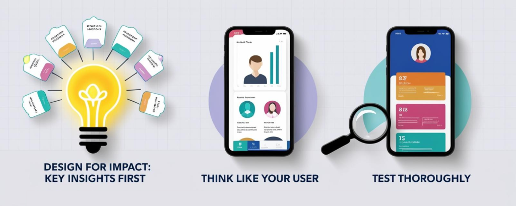
1. Design for Impact: Key Insights First
Mobile screens have limited real estate, making it essential to focus on what truly matters. Here’s how:
- Aspect Ratios Matter: Transitioning from a desktop’s 16:9 layout to the mobile-friendly 9:16 ratio requires thoughtful design. Prioritise visuals that provide maximum value.
- Combine and Simplify Visuals: Layering visuals, for example combining total revenue with a sparkline for trends, saves space and delivers more context in one glance.
- Colour and Contrast: Use high-contrast colours to highlight key metrics and guide users’ attention. Let your most important KPIs pop, ensuring the data tells its story immediately.
- Font Size Matters: Stick to font sizes between 12–14 points. This ensures readability without wasting precious screen space.
- Declutter: Remove gridlines, simplify legends, and eliminate excessive labels to keep the report clean and professional. A favourite hack I like to work with here is to duplicate any visuals that need tweaking, and then hiding them in the desktop view by sending to back in the format pane.
2. Think Like Your User
Put yourself in your users’ shoes. What do they need, and how will they interact with your report?
- Context Is Key: A sales manager might need quick KPI snapshots, while a field worker may require an interactive map. Tailor the experience accordingly.
- Make It App-Like: Users are accustomed to intuitive mobile apps. Design your report to feel equally simple, with touch-friendly elements and minimal steps to access key insights.
- Guide Their Journey: Include prompts such as “Flip your device horizontally for more details” or buttons that direct users to the full desktop report for in-depth exploration.
- Maximise Interactivity: Use bookmarks, drill-throughs, and navigation buttons to create a seamless, engaging experience. For example, a navigation button labelled “See Regional Performance” can quickly guide users to detailed insights.
3. Test, Test, Test
No design is complete without thorough testing, and this step cannot be overlooked.
- Simulators Aren’t Enough: While Power BI Desktop’s mobile layout is helpful, it’s not a bulletproof view of how your report will behave on an actual device.
- How to Preview on Real Devices:
- Publish the report to the Power BI Service.
- Open the Power BI Mobile app to interact with the report as your users would.
- Testing Checklist:
- Are all visuals clear and legible without zooming?
- Do buttons, slicers, and other interactive elements work as expected?
- Is navigation intuitive and fluid?
- Does the report load quickly, even on slower mobile networks?
Testing ensures that your mobile report is not only functional but also delivers an excellent user experience, whether it’s accessed on a bustling commute or during a quick coffee break between meetings.

Conclusion
Designing mobile-friendly Power BI reports isn’t just a technical adjustment, it’s about ensuring your insights are always within reach, no matter where or how they are accessed. By focusing on impactful metrics, optimising readability, and enhancing interactivity, you can create a seamless experience that empowers decision-makers to act with confidence.
The best mobile reports don’t replicate desktop views, they are thoughtfully tailored to suit the unique demands of smaller screens and busy users. Through careful testing and iteration, you can refine your designs to deliver maximum value without compromising usability.
As businesses continue to rely on data-driven decisions, mobile reports are becoming an indispensable tool for agility and accessibility. Whether you’re creating a dashboard for a sales executive or a team in the field, these best practices will help you transform your reports into a dynamic, user-friendly asset.
Now it’s your turn. Why not try building a mobile layout in Power BI today?
Useful Links & Sources:
Mobile layout view – Power BI | Microsoft Learn
Optimize visual formatting for mobile layout – Power BI | Microsoft Learn

