Introduction
I remember feeling somewhat lost on the first large-scale data warehousing project I was put on in late 2012, early in my consulting career. SAP was trying to win the business of Europe’s largest chain of hardware stores, and thus as an early career consultant in SAP’s Business Analytics division, I was staffed on the team hired to replatform their entire data stack from Oracle onto SAP.
At the time, I’d like to think I was a pretty strong database developer with some pretty sharp SQL skills, but had still never really spent any time digging into the academic rigors of data warehousing as its own discipline.
As the team started discussing this particular company’s various product hierarchies, I found myself feeling a bit lost as folks threw around terms like “root nodes”, “leaf nodes”, “hierarchy levels” and “recursive CTEs”. Nonetheless, I muddled my way through the discussion, ended up successfully executing my first large data warehousing project, and since then have spent many years developing experience, skills and technological contributions to the disciplines of data modeling, data engineering and BI development, including those disciplines as they relate to hierarchies.
So, given that initial confusion at the onset of my career, the subsequent career progression in the way of all things data engineering, and my overall frustration with the lack of high quality content when it comes to understanding how to extract, model, transform, and consume hierarchies, I thought it would be helpful to put together this series of posts as a resource I wish I’d had on that first project - a detailed and systematic introduction to hierarchies with lots of examples, discussion of edge cases, and most importantly – working SQL to dig deep into a subject area that can get quite complex.
So whether you’re earlier in your data engineering career, or if you’re more senior but looking for a refresher, I hope you’ll walk away from this series of posts with a much stronger understanding of hierarchies and how to both model and consume them, primarily in the context of BI.
Goals
Now, there’s an endless amount of blog posts out there that cover hierarchies in the context of data warehousing and BI, so I thought it would be helpful to flesh out my specific goals with this post that I feel haven’t really been met by most of the other content out there.
So, in no particular, the goals of this blog series include:
- Simplification — My personal opinion is that most authors over-complicate discussions of hierarchies by glossing over the fundamentals and jumping immediately to complex topics (such as this eyesore demonstrating heterogeneous hierarchies). So, by first focusing on such fundamentals, I hope to then make the more complex aspects of hierarchies much easier to understand.
- Technical Context — hierarchies are a subset of “directed acyclic graphs” (DAGs) which themselves are a subset of graphs. In my opinion, a brief discussion of these different data structures helps Data Engineers, especially those lacking a formal computer science background, better understand the technical concepts underlying hierarchies.
- Disambiguation — most content I’ve seen on hierarchies muddies the waters between technical theory and real-world use cases, so I hope to more effectively handle those contexts separately before synthesising them. I also hope to deliberately address the vocabulary of hierarchies and disambiguate terms I often see confused, muddled, or simply never addressed (such as the relationship between “parent/child tables”, and “parent-child hierarchies”, as just one example).
- Data Model — I’m also not satisfied with the data model(s) most authors have put forth for hierarchies. So, I’ll share a few generic data models (and iterations thereof) that can accommodate the ingestion, transformation and consumption layers of the most common types of hierarchies (parent/child, level, unbalanced, ragged, heterogenous, time-dependent, etc.) along with a brief discussion of the tradeoffs of a schema-on-write model vs. schema-on-read for hierarchy processing data pipelines.
Contents
Here’s is a high-level summary of each of the seven posts in these series:
- Post 1: Introducing Graphs
- Post 2: Introducing DAGs
- Post 3: Introducing Parent-Child Hierarchies
- Post 4: Introducing Level Hierarchies
- Post 5: Handling Ragged and Unbalanced Hierarchies
- Post 6: Hierarchy Review (Data Modeling)
Note that the emphasis in the first five posts is largely conceptual (although some SQL is provided where relevant). A detailed review of relational data models for hierarchies, their corresponding SQL definitions and ETL logic, and a brief discussion on architecture and tradeoffs are addressed specifically in Post 6.
Also note that the query language MDX and its role in consuming hierarchies is touched on at a few points throughout this series of posts, but doesn’t take a central role given its (unfortunate) absence in most “modern data stack” deployments.
Graphs
As noted in the contents above, this particular post will introduce the concept of graphs. The intent is to provide a basic understanding of the generic data structure of which hierarchies are one particular type.
So, let’s start with what we mean by “graph”. In the context of BI, one might immediately think of something like a line chart in a BI tool like Tableau (i.e. graphing data points on a Cartesian plane).
However, the academic concept of a graph from computer science is a separate and distinct concept that describes a data structure that generally represents things and their relationships to one another. More specifically, these things are referred to as nodes (or sometimes “vertices”), and the relationships between nodes are referred to as edges.
Here’s a rather trivial (and abstract) example:
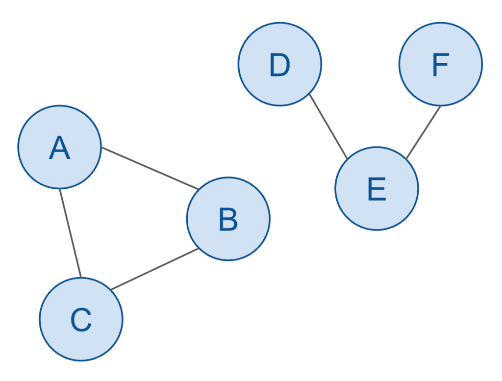
In the above example, there are:
- Six nodes
- Five edges
- Two subgraphs
- One cycle
Can you identify each of those concepts just from the visual depiction of this graph?
The nodes and edges should be easy to figure out.
- Nodes: A, B, C, D, E, F
- Edges: A-B, B-C, C-A, D-E, E-F
The two subgraphs should be easy enough to intuit. The above graph shows that A, B, and C are related, and also the D, E and F are related, but each of these collections of nodes aren’t related to each other. That means each of them constitute their own “subgraph”.
(I’m being a bit informal with my terminology here. The overall dataset is technically called a “disconnected graph” since there are two sets of nodes/edges (subgraphs), also called components, which cannot reach other. We could also call it a graph with two connected subgraphs… but in any case, these details are not particularly germane to the rest of this discussion, and thus the formal vernacular of graph theory won’t be addressed much further since it historically hasn’t played an important role in the discussion of hierarchies nor other related topics in the fields of data engineering and business intelligence.)
And lastly, the one cycle should be relatively intuitive. A cycle is a path through the graph that repeats its edges. In other words, I could put the tip of a pencil on the node A (and moving only in one direction) can trace my way from A > B > C and then back to A. This is called a cycle, and clearly there’s no way to do the same thing from D, for example (hence the second sub-graph does not have a cycle).
In the way of a simple SQL example, we could model this data in a relational database (like Snowflake) as follows:
/*
    Create tables
*/
CREATE TABLE IF NOT EXISTS NODES
(
    NODE_ID TEXT
);

CREATE TABLE IF NOT EXISTS EDGES
(
    NODE_ID_FROM TEXT,
    NODE_ID_TO TEXT
);

/*
    Populate tables
*/
INSERT INTO
    NODES
VALUES
    ('A'), ('B'), ('C'), ('D'), ('E'), ('F');

INSERT INTO
    EDGES
VALUES
    ('A', 'B'),
    ('B', 'C'),
    ('C', 'A'),
    ('D', 'E'),
    ('E', 'F');
Granted, this is an incredibly simple model, and should probably be extended (i.e. to accommodate attributes associated with each node/edges, as well as accommodate multiple graphs), but it illustrates the concept.
Now, one thing worth calling out is the names of the the columns in the EDGES table. The fact that they contain the prepositions “TO” and “FROM” imply a direction, i.e. from the NODE_ID_FROM node to the NODE_ID_TO node. (In practice, these are often also referred to as the “predecessor” node and the “successor” node.)
This illustrates the last concept worth highlighting, i.e. whether we treat a graph as directed or undirected. (Graphs are NOT always directed, and thus these naming conventions are not entirely generic for arbitrary graphs. However, we won’t consider the case of arbitrary graphs much further, whereas directed graphs will play an important role in the rest of our discussion.)
In other words, we sometimes might care about some concept of directionality or precedence, i.e. when a given node should somehow come before another node that it’s related to.
Let’s further flesh these concepts out with a real-world use case from the world of logistics.
Logistics is, “the part of supply chain management that deals with the efficient forward and reverse flow of goods, services, and related information from the point of origin to the point of consumption.” Large supply chains consist of the waterways, railways, and roads that connect cargo vehicles (ships, trains, trucks) all across the globe.

In order to simplify the example, which let’s just consider a single example most of us experience every day: navigating from one point to another using our favorite map app on our phone.
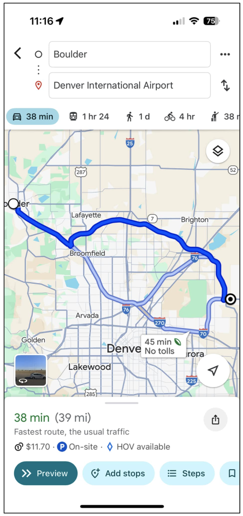
This is obviously a screenshot from my Google Maps app on my phone, showing directions from Boulder to Denver International Airport.
From a data perspective, clearly Google Maps is leveraging geospatial data to visually trace out the exact routes that I could take, but what it’s also doing is figuring out and displaying graph data (which is not actually concerned at all with any geospatial coordinates).
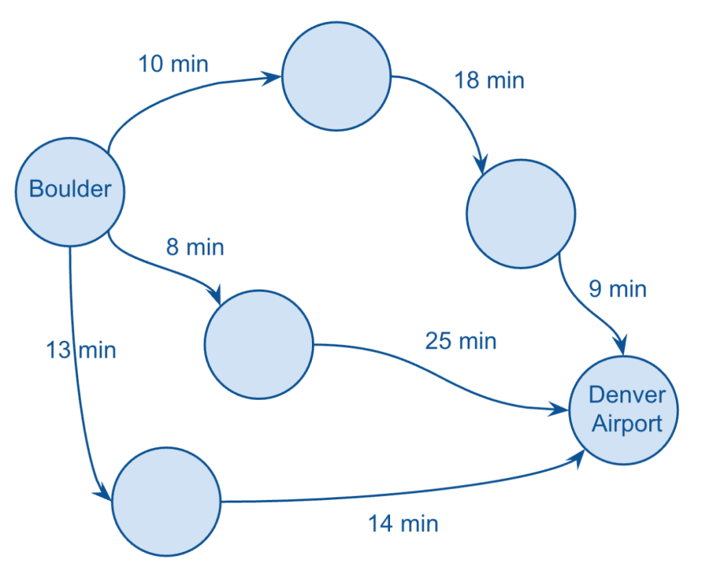
In short, Google Maps is using sophisticated (graph) algorithms to select a handful of routes that are likely to make the most sense for me to choose from, based on time and/or distance.
In my case, I was given three different routes, which I’ve visualised above by just showing the durations for each leg of each route (taking a few liberties here with my version of the graph).
Clearly, Google Maps is summing up the amount of time each leg of each route, and assigning that total value to each route, and displaying them so that I can choose the shortest option.
It’s also showing things like any associated toll road fees (which I’ll just call cost), as well as the total distance.
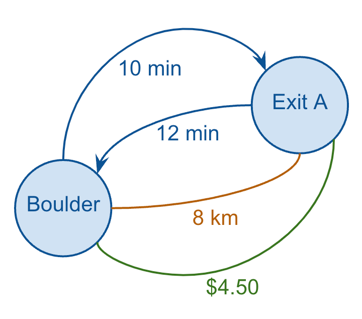
So, I have three metrics to choose from, for each edge (duration, distance, and cost), and a simple exercise worth thinking about is which of these “edge metrics” should be considered directed vs. undirected:
- Duration: directed
- Distance: undirected
- Cost: undirected
Let me briefly explain.
Duration can often differ in one direction compared to the reverse direction (even though they cover the same route and distance), for example, in cases when there’s a large influx of traffic in one direction, i.e. from suburbs into commercial city centers during the morning rush hour.
Distance between two points on the same leg is pretty much always the same, so that’s an undirected metric (bear with me here — I’m ignoring important edges cases such as construction which might only impact one direction of traffic). And toll road fees (cost) are almost always a function of distance, not time, so those metrics also remain undirected.
So, I can redraw just one leg of one route and show all of these metrics, which also demonstrates how a graph can have multiple edges between the same two nodes (and how some edges can be directed while others can be undirected).
And if I wanted to capture all of this data in my (relational) database, I might model it as follows:
CREATE TABLE IF NOT EXISTS EDGES
(
    NODE_ID_FROM TEXT,
    NODE_ID_TO TEXT,
    DIRECTION TEXT,
    METRIC TEXT,
    AMOUNT DECIMAL
);

INSERT INTO
    EDGES
VALUES
    ('Boulder', 'Exit A', 'DEFAULT', 'Duration', 10.0),
    ('Boulder', 'Exit A', 'REVERSE', 'Duration', 12),
    ('Boulder', 'Exit A', NULL, 'Distance', 8),
    ('Boulder', 'Exit A', NULL, 'Cost', 4.5);
I chose this example not only because it’s intuitive and helps flesh out the key concepts of graphs, but also because it represents a great example of a significant software engineering challenge in a critical real-world use case, i.e. how to optimise supply chain logistics on a much larger scale.
For example, think of all of the manufacturers, shipping ports, distribution centers, warehouses, and stores associated with Wal-Mart across the world, along with the different transport types (truck, train, ship… drone?). Optimising the supply chain of large enterprises is quite clearly a formidable challenge and has played an important role in the development of various graph databases and various graph algorithms.
However, for our purposes we don’t need to go much further down the path of specific technologies or algorithms. It’s sufficient for our discussion of hierarchies to understand the basic of graphs from a data modeling perspective, so let’s briefly summarise the important features of a graph before moving on.
Summary
The important points to keep in mind that characterize graphs include the following:
- A graph consists of one or more nodes
- Nodes are related to other nodes via one or more edges
- Nodes that that can reach themselves again (by traversing the graph in a single direction) indicate the graph has a cycle
- A given edge can be directed or undirected
- Any set of nodes that can’t reach other sets of nodes are a subgraph.
- Nodes and edges can have *attributes associated with them.
*Such attributes can consist of numerical values used in advanced analytics and algorithms. One such example would be numerical attributes of edges called “weights” and numerical attributes of nodes called “biases” which are leveraged in neural networks, which are the graphs undergirding large language models (LLMs) such as ChatGPT.
(Since this is not a BI use case per se, I’m avoiding the typical distinction between “measures” and “attributes”.)
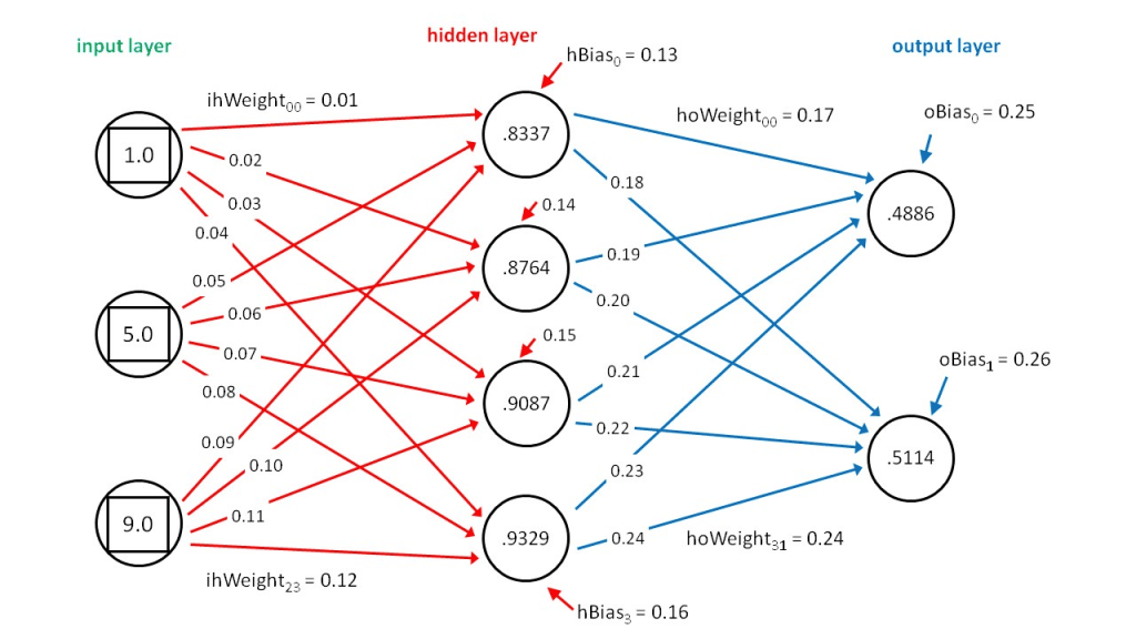
Hopefully you’ll find those points simple enough to remember, at it covers pretty much everything you’ll need to know about graphs in the context of data engineering! Again, we’re not particularly concerned with graph algorithms, but rather just the structure of graphs themselves.
In the next post, we’ll impose a few constraints on the definition of a graph to arrive at the concept of a direct acyclic graph (DAG), which will help further motivate our introduction of hierarchies.
And for reference, here are links to the subsequent posts in this series:
More Than Pipelines: DAGs as Precursors to Hierarchies (2 of 6)
Family Matters: Introducing Parent-Child Hierarchies (3 of 6)
Flat Out: Introducing Level Hierarchies (4 of 6)
Edge Cases: Handling Ragged and Unbalanced Hierarchies (5 of 6)
Tied With A Bow: Wrapping Up the Hierarchy Discussion (Part 6 of 6)

